Big Data - Plant gene expression workshop 3
Andrea Harper

Introduction
Aims
In this workshop, we will graph some of the results we generated in Workshop 2, and identify some of the markers that are significantly associated with the glucosinolate trait. The examples used in this workshop continue using the results from the small dataset. When you’re ready, work though all of the workshops using the large dataset which you can find here, or from the Data Sets tab in the VLE.
Learning Outcomes
By doing this practical and carrying out the independent study the successful student will be able to:
- create graphs of our results
- identify genes with expression significantly associated with trait data
Getting started
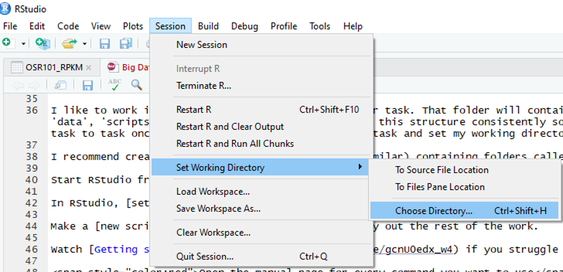
Start RStudio from the Start menu
In RStudio, set your working directory to your scripts folder
Identifying interesting results
Open the results file you created in workshop 2, and take a look at the first five rows
##              Df    Sum.Sq   Mean.Sq    F.value   P.value           R2
## A_JCVI_10003  1 621.42226 621.42226 0.63884240 0.4278372 0.0123713541
## A_JCVI_10018  1  29.86376  29.86376 0.03033915 0.8624125 0.0005945316
## A_JCVI_10019  1 470.69649 470.69649 0.48242565 0.4904779 0.0093706860
## A_JCVI_10026  1 133.66851 133.66851 0.13607770 0.7137389 0.0026610898
## A_JCVI_10036  1 155.57474 155.57474 0.15844805 0.6922509 0.0030972020
##              Intercept   Gradient
## A_JCVI_10003  48.88972 -1.3402828
## A_JCVI_10018  40.44312  0.2956792
## A_JCVI_10019  51.01240 -2.7162996
## A_JCVI_10026  47.96460 -2.4231560
## A_JCVI_10036  36.88214  3.8151561
We have a lot of statistics here, but the p values tell us which genes show the strongest relationship with our trait. But how do we know if the p values are different from what we would expect if there were no significant results (the null hypothesis)?
We can use two functions to help with this, qqnorm produces a normal QQ plot of the variable and qqline adds a reference line
Let’s try it with our results
qqnorm(results$P.value, pch = 1, frame = FALSE)
qqline(results$P.value, col = "steelblue", lwd = 2)
As you can see, this function has computed the quantiles for a theoretical, normal range of p values (x axis), and plotted them against the quantiles for your P values (y axis). If there were no significant results in your data, we would expect the data to follow the line. As you can see, there is some divergence from the line, but how significant is it?
We can also plot these so-called Q-Q plots (quantile-quantile) using a library called car, which also provides confidence intervals
library("car")## Loading required package: carDataqqPlot(results$P.value)
## [1] 43 26Much nicer! As we can now see, some of our results fall outside the confidence intervals
So, which genes have the best p values? Let’s take another look at our data, but this time, let’s sort it by ascending p value so that the best results are at the top of the table. We can do that using the order to order the rows by their p value. We’ll take a look at the first five rows.
results_sorted <- results[order(results$P.value),]
results_sorted[1:5,]
## Df Sum.Sq Mean.Sq F.value P.value R2
## A_JCVI_10238 1 11408.052 11408.052 14.986357 0.0003092814 0.2271130
## A_JCVI_10398 1 10306.477 10306.477 13.165687 0.0006596128 0.2051827
## A_JCVI_10097 1 7299.818 7299.818 8.671854 0.0048576830 0.1453257
## A_JCVI_10299 1 5695.814 5695.814 6.522668 0.0136817492 0.1133930
## A_JCVI_10155 1 5091.926 5091.926 5.753102 0.0201550254 0.1013707
## Intercept Gradient
## A_JCVI_10238 7.503403 3.7931699
## A_JCVI_10398 87.651634 -6.2952872
## A_JCVI_10097 16.374764 2.4834231
## A_JCVI_10299 75.122442 -0.1349702
## A_JCVI_10155 12.505862 2.5569946Mapping results
Great! Save this file if you like. I wonder if the top few genes are all in the same place on the genome? There is an additional file provided called osr_dir.txt, which has information about the chromosome and map positions for every gene in the dataset. Let’s open it and take a look.
dir <- read.delim("http://www-users.york.ac.uk/~ah1309/BigData/data/osr_dir.txt")
dim(dir)
## [1] 13597 3dir[1:5,]## Gene Graph Position
## 1 A_JCVI_33904 1 1
## 2 A_JCVI_27430 1 2
## 3 A_JCVI_26834 1 3
## 4 A_JCVI_22505 1 4
## 5 A_JCVI_4601 1 5Let’s open it again, but this time, set the first column to be the row names
dir <- read.delim("http://www-users.york.ac.uk/~ah1309/BigData/data/osr_dir.txt", row.names=1)
dim(dir)
## [1] 13597 2dir[1:5,]## Graph Position
## A_JCVI_33904 1 1
## A_JCVI_27430 1 2
## A_JCVI_26834 1 3
## A_JCVI_22505 1 4
## A_JCVI_4601 1 5Much better. In this file, the Graph column designates different chromosomes, and the position column tells you what order the genes are in on that chromosome. This should be enough information to put our results in genome order.
Let’s start by merging the files again as we did in workshop 2. Take a look if you like.
results_dir <- merge(dir, results, by="row.names")
results_dir[1:5,]
## Row.names Graph Position Df Sum.Sq Mean.Sq F.value P.value
## 1 A_JCVI_10003 2 3363 1 621.42226 621.42226 0.63884240 0.4278372
## 2 A_JCVI_10018 2 3385 1 29.86376 29.86376 0.03033915 0.8624125
## 3 A_JCVI_10019 2 1122 1 470.69649 470.69649 0.48242565 0.4904779
## 4 A_JCVI_10026 2 1945 1 133.66851 133.66851 0.13607770 0.7137389
## 5 A_JCVI_10036 1 5014 1 155.57474 155.57474 0.15844805 0.6922509
## R2 Intercept Gradient
## 1 0.0123713541 48.88972 -1.3402828
## 2 0.0005945316 40.44312 0.2956792
## 3 0.0093706860 51.01240 -2.7162996
## 4 0.0026610898 47.96460 -2.4231560
## 5 0.0030972020 36.88214 3.8151561Let’s order them by p value again and see if the top results are in the same place in the genome
results_sorted2 <- results_dir[order(results_dir$P.value),]
results_sorted2[1:5,]
## Row.names Graph Position Df Sum.Sq Mean.Sq F.value
## 38 A_JCVI_10238 1 528 1 11408.052 11408.052 14.986357
## 67 A_JCVI_10398 2 655 1 10306.477 10306.477 13.165687
## 18 A_JCVI_10097 1 8093 1 7299.818 7299.818 8.671854
## 47 A_JCVI_10299 2 4320 1 5695.814 5695.814 6.522668
## 24 A_JCVI_10155 1 1837 1 5091.926 5091.926 5.753102
## P.value R2 Intercept Gradient
## 38 0.0003092814 0.2271130 7.503403 3.7931699
## 67 0.0006596128 0.2051827 87.651634 -6.2952872
## 18 0.0048576830 0.1453257 16.374764 2.4834231
## 47 0.0136817492 0.1133930 75.122442 -0.1349702
## 24 0.0201550254 0.1013707 12.505862 2.5569946Hmm, they don’t seem to be very close to each other, but let’s graph them all in genome order to be sure!
As the best p values are likely to be very small, they probably won’t be very clear on a graph. Let’s do a simple transformation so that they become the highest points on the graph. The most common way to do this is to use the -log10 of the p values. We can create a new column directly in the dataframe like this:
results_sorted2$logP <- -log10(results_sorted2$P.value)
results_sorted2[1:5,]
## Row.names Graph Position Df Sum.Sq Mean.Sq F.value
## 38 A_JCVI_10238 1 528 1 11408.052 11408.052 14.986357
## 67 A_JCVI_10398 2 655 1 10306.477 10306.477 13.165687
## 18 A_JCVI_10097 1 8093 1 7299.818 7299.818 8.671854
## 47 A_JCVI_10299 2 4320 1 5695.814 5695.814 6.522668
## 24 A_JCVI_10155 1 1837 1 5091.926 5091.926 5.753102
## P.value R2 Intercept Gradient logP
## 38 0.0003092814 0.2271130 7.503403 3.7931699 3.509646
## 67 0.0006596128 0.2051827 87.651634 -6.2952872 3.180711
## 18 0.0048576830 0.1453257 16.374764 2.4834231 2.313571
## 47 0.0136817492 0.1133930 75.122442 -0.1349702 1.863858
## 24 0.0201550254 0.1013707 12.505862 2.5569946 1.695617As you can see, this has created a new column called logP with -log transformed p values. Now we can graph them!
Let’s create a new object for chromosome 1 using the subset function again. Don’t forget to look at the new objects or check the dimensions to make sure the function has done what you expected it to do!
#This will subset results_sorted2, keeping only the rows that have a 1 in the Graph column, and saving as a new object called chr1
chr1 <- subset(results_sorted2, results_sorted2$Graph==1)
dim(chr1)## [1] 44 12Let’s try a simple plot, with map position on the x axis, and our transformed p values on the Y axis
plot(chr1$Position, chr1$logP)
This does the job, but it is pretty basic. As our data is already Tidy data, we can also use ggplot() to make a better graph.
library(ggplot2)Here’s a basic plot…
ggplot(chr1, aes(x=Position, y=logP))+ geom_point()
Changing the point size and using classic theme…
ggplot(chr1, aes(x=Position, y=logP))+ geom_point(size=2)+theme_classic()
Try playing around with some of the ggplot settings to get a graph that you like the look of, and clearly describes the data.
Multiple Test Corrections
Now we can see that one point is higher than the others, but is it significant? What was the p value?
min(results_dir$P.value)## [1] 0.0003092814Normally, a p value this low would be highly significant, but with big data we need to be even more stringent. This is because the more tests you perform, the more likely it is that some are false positives (Type 1 errors). So, how many tests did we perform in our “for” loop regressions? Simple - it is the number of rows in our results table…
nrow(results_dir)## [1] 73The simplest way to account for Type 1 error, is to adjust the threshold at which we consider a result “significant”. The most commonly used, and most stringent adjustment, is called Bonferroni adjustment. This uses a simple calculation, which is the usual significance threshold (normally 0.05), divided by the number of tests. We’ll also transform it using -log10 as we did for the p values
bon <- -log10(0.05/73)
bon## [1] 3.164353Using this threshold, we can draw a line on our plot, so that any points passing Bonferroni threshold will be more obvious
ggplot(chr1, aes(x=Position, y=logP))+ geom_point(size=2)+theme_classic() + geom_hline(yintercept = bon) It looks like our top point is the only one that passes the threshold, but of course Bonferroni is very stringent. A less stringent approach, is to adjust your p values entirely, according to the False Discovery Rate (FDR), but there is a bit more work required to calculate it.
The first step is to put our results in p value order. We did this earlier and called our object results_sorted2
##       Row.names Graph Position Df    Sum.Sq   Mean.Sq   F.value
## 38 A_JCVI_10238     1      528  1 11408.052 11408.052 14.986357
## 67 A_JCVI_10398     2      655  1 10306.477 10306.477 13.165687
## 18 A_JCVI_10097     1     8093  1  7299.818  7299.818  8.671854
## 47 A_JCVI_10299     2     4320  1  5695.814  5695.814  6.522668
## 24 A_JCVI_10155     1     1837  1  5091.926  5091.926  5.753102
##         P.value        R2 Intercept   Gradient     logP
## 38 0.0003092814 0.2271130  7.503403  3.7931699 3.509646
## 67 0.0006596128 0.2051827 87.651634 -6.2952872 3.180711
## 18 0.0048576830 0.1453257 16.374764  2.4834231 2.313571
## 47 0.0136817492 0.1133930 75.122442 -0.1349702 1.863858
## 24 0.0201550254 0.1013707 12.505862 2.5569946 1.695617Next we need to create a new column which contains the rank for the p values in each row. Now our data is in order, we can do this easily by using gl() to fill in numbers specified by the number of rows
#v=number of rows in our file
v=nrow(results_sorted2)
#Add new column with numbers from 1 to v
results_sorted2$Rank <- 1:v
#Take a look
results_sorted2[1:5,]
## Row.names Graph Position Df Sum.Sq Mean.Sq F.value
## 38 A_JCVI_10238 1 528 1 11408.052 11408.052 14.986357
## 67 A_JCVI_10398 2 655 1 10306.477 10306.477 13.165687
## 18 A_JCVI_10097 1 8093 1 7299.818 7299.818 8.671854
## 47 A_JCVI_10299 2 4320 1 5695.814 5695.814 6.522668
## 24 A_JCVI_10155 1 1837 1 5091.926 5091.926 5.753102
## P.value R2 Intercept Gradient logP Rank
## 38 0.0003092814 0.2271130 7.503403 3.7931699 3.509646 1
## 67 0.0006596128 0.2051827 87.651634 -6.2952872 3.180711 2
## 18 0.0048576830 0.1453257 16.374764 2.4834231 2.313571 3
## 47 0.0136817492 0.1133930 75.122442 -0.1349702 1.863858 4
## 24 0.0201550254 0.1013707 12.505862 2.5569946 1.695617 5Now we can do the False Discovery Rate correction of our p values, using the following formula for each row in the dataset:
p value*(number of rows/rank)
Let’s add the corrected p values into a new column called FDR
#Calculate FDR
results_sorted2$FDR <- results_sorted2$P.value*(v/results_sorted2$Rank)
results_sorted2[1:5,]
## Row.names Graph Position Df Sum.Sq Mean.Sq F.value
## 38 A_JCVI_10238 1 528 1 11408.052 11408.052 14.986357
## 67 A_JCVI_10398 2 655 1 10306.477 10306.477 13.165687
## 18 A_JCVI_10097 1 8093 1 7299.818 7299.818 8.671854
## 47 A_JCVI_10299 2 4320 1 5695.814 5695.814 6.522668
## 24 A_JCVI_10155 1 1837 1 5091.926 5091.926 5.753102
## P.value R2 Intercept Gradient logP Rank FDR
## 38 0.0003092814 0.2271130 7.503403 3.7931699 3.509646 1 0.02257754
## 67 0.0006596128 0.2051827 87.651634 -6.2952872 3.180711 2 0.02407587
## 18 0.0048576830 0.1453257 16.374764 2.4834231 2.313571 3 0.11820362
## 47 0.0136817492 0.1133930 75.122442 -0.1349702 1.863858 4 0.24969192
## 24 0.0201550254 0.1013707 12.505862 2.5569946 1.695617 5 0.29426337As you can see, the top two markers are below the 0.05 False Discovery Rate adjustment, and can be considered significant.
Let’s clean up this file and save it…
Change the first column name to “Gene”
colnames(results_sorted2)[1] <- c("Gene")Save this file as your final results file, excluding the rownames
write.table(results_sorted2, "Final results.txt", quote=F, sep="\t", row.names=F)For next time
Try completing these tasks using your results from the full dataset. The full dataset is here if you need it.
save.image("Workshop3.Rda")