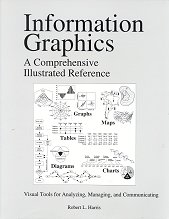
This splendid reference work describes almost every conceivable chart, table and graph design, clearly laid out and explained. As the author notes, recent advances in computer software have enabled the production of more sophisticated graphics. (Unfortunately, some "advances" have also enabled horrendous chartjunk.) This book presents a vast array of styles to choose from.
As well as in-depth descriptions of conventional bar charts, pie charts, scatter diagrams, and the like, there are less familiar displays, such as the fuzzygram (to represent probabilities on histograms), parallel coordinates (to display multiple characteristics of multiple entities), and sunflower symbols (to indicate the number of overlaid items). I was particularly taken with the candlestick chart, where each symbol compactly displays five items of stock information (open, close, high, and low prices, and a graphic indication of whether the price went up or down). This uses an adaptation of the box graph, which can encode several percentiles, and mean and median information, in each symbol.
All is beautifully laid out and displayed with black and white line drawings. But unfortunately this does mean that the use of colour (and warnings of the misuse of colour) gets short shrift, with no actual examples.
About my only quibble, and it is very minor, is with the description of Venn Diagrams, which says that technically there is no restriction on the number [of circles] that can be used, and then shows an arrangement of four circles that is not completely general: although there is an area representing the intersection of A and B, and of A and C, there is no area representing the intersection of just A and D. (It is possible to draw a fully general diagram, using four ellipses, or non-convex shapes. Totally general diagrams with more sets are more difficult, and do require non-convex shapes.)
In addition to covering the basic uses of each kind of chart, Harris often goes on to explain variations, and how to use a chart in more advanced cases, such as displaying multiple sets of data with a pie chart, or angles greater than 360 degrees in a circular plot. He also gives many examples of different ways of displaying the same data, allowing the pros and cons of each to be readily determined.
Whereas Tufte provides the rationale and the aesthetics, this provides a vast array of available techniques, to use directly, or to adapt. Read them together to get a solid basis for generating your own appropriate communicative charts and graphs.
