Quant & Comp: Data Visualisation
Leo Caves
Autumn Term
WWW Do online | PC Do on your computer | R Do in RStudio | ? Think about and answer
Getting Started
PC Create a folder “DataVis” (preferably a subfolder where you have stored other materials for 32I; Start RStudio from the Start menu
R In RStudio, set your working directory to your new folder
R Make a new script file called datavis.R to carry out the rest of the work.
Open the manual page for every command you want to use e.g. ?length
Preamble
We are going to use the iris dataset which is built-in to R. The data is a set of 5 measurements on 50 flowers from 3 species of iris.
R Familiarise yourself with the data, by typing ?iris and head(iris) into the Console.
Basic plots in R
R has some basic plotting functionality built-in; let’s see look at the iris data.
plot(iris$Sepal.Length,iris$Sepal.Width)
Let’s agree that its convenient, but rudimentary. R’s basic graphics has numerous parameters that control its plotting functions, but it can be laborious and confusing to wade through them (but in principle, much of what we do below, we can do with the basic R plotting functions).
To help ease the construction of plots in R, there is a packagem ggplot2, that implements the Grammar of Graphics (Wilkinson, 1995).
Grammar of Graphics in R: ggplot2
Elements of the grammar
Explicit features
- data: what is to be plotted.
- variables from a data.frame
- aes: aesthetic mapping - how the variables are mapped to visual features that can be used to represent properties of the variables
- e.g. x, y, color, shape, size, linetype, pointtype
- geom: geometric mapping - visible elements on the plot
- e.g. line, points, polygons, bars, etc.
Implicit (or optional) features
- stat: a statistical transformation of the original dataset itself
- binning (for e.g. histograms), quantiles, smoothing etc.
- scales: how to map values in the data to values in the aesthetic (color, size, shape, …).
- log, log10, sqrt etc.
- Scales are reported in a legend or axis labels on the plot.
- coord: how map variables into a coordinate system for plotting.
e.g. Cartesian, polar, various mapping projections etc.
facet: Faceting describes how to break up the data into subsets and display those in subplots.
WWW For reference, you might want to have this handy: ggplot2 cheat sheet
Loading the package
library(ggplot2)
#If this fails, then type: install.packages("ggplot2") and try again.
Building up a plot
Back to the iris data, let’s now use ggplot.
Basic plot
myplot <- ggplot(data = iris, aes(x = Sepal.Length, y = Sepal.Width)) + geom_point()
myplot
Changing plot symbols size: geom
First tweak: increase the size of the dots
myplot <- ggplot(iris, aes(Sepal.Length, Sepal.Width)) +
geom_point(size = 3)
myplot
? What do you notice about the plot? Are certain points plotted over each other? What could you do about this? R ?geom_jitter. Try it…
Changing plot symbol colours: aes
Now add some colour to differentiate the species:
myplot <- ggplot(iris, aes(Sepal.Length, Sepal.Width, color = Species)) +
geom_point(size = 3)
myplot
Notice how you get a legend included by default.
Changing plotting symbol: geom
Now change the plotting symbol to indicate the species:
myplot <- ggplot(iris, aes(Sepal.Length, Sepal.Width, color = Species)) +
geom_point(aes(shape = Species), size = 3)
myplot
Modifying the mapping of data to the plot: coord
Both variables in this data are in units of cm. Let’s modify the coordinate system to make ensure that a unit on the x axis has the same length as a unit on the y axis: ?coord_fixed
myplot <- ggplot(iris, aes(Sepal.Length, Sepal.Width, color = Species)) +
geom_point(aes(shape = Species), size = 3) +
  coord_fixed()
myplot
Creating multiple plots: facets
Perhaps overlaying all this data is obscuring the trends, lets split it out separate plots for each species. For this we use facet_wrap.
myplot <- ggplot(iris, aes(Sepal.Length, Sepal.Width, color = Species)) +
geom_point(aes(shape = Species), size = 3) +
  coord_fixed() +
  facet_wrap(~ Species)
myplot
R Check out the powerful facet_wrap function. ?facet_wrap
WWW This is an example of Tufte’s small multiples. Take a look for some examples online. ? What do you learn from this?
Fitting a model: stat
You may want to fit a model to the different species:
myplot <- ggplot(iris, aes(Sepal.Length, Sepal.Width, color = Species)) +
geom_point(aes(shape = Species), size = 3) +
  coord_fixed() +
  facet_wrap(~ Species) +
  stat_smooth(method = "lm", formula = y ~ x)
myplot
By default we got a 95% confidence interval; lets switch that off, and also make the line of best fit black.
myplot <- ggplot(iris, aes(Sepal.Length, Sepal.Width, color = Species)) +
geom_point(aes(shape = Species), size = 3) +
  coord_fixed() +
  facet_wrap(~ Species) +
  stat_smooth(method = "lm", formula = y ~ x,se=F,color="black") +
  theme_bw()              # for clean look overall
myplot
R Look into themes: ?themes
We’ve just experienced examples of the powerful compositional nature of the grammar of graphics. We tried it on some 2D (scatter plot) continuous data. Let’s now explore a little more on different types of data.
1-D Data visualisation
We’ll use the iris data again, but just look at one variable.
Histograms
Basic histogram:
ggplot(iris, aes(x = Sepal.Width)) +
  geom_histogram(binwidth=0.2,aes(y=..density..),color="grey")
Add a kernel density function:
ggplot(iris, aes(x = Sepal.Width)) +
  geom_histogram(binwidth=0.2,aes(y=..density..),color="grey") +
  stat_density(alpha=0.4) +
  theme_bw()
To understand this, you need to look at how statistical functions compute their own variables that can be referred to by the .. notation e.g. ..density..
R ?geom_histogram
Visualisation Tip: Also you can see how we are plotting one plot over another, and to avoid them overwriting each other, we are using transparency on the density plot, through the value of alpha (channel) R ?alpha
Look at the distibution for different species.
ggplot(iris, aes(x = Sepal.Width, fill = Species)) +
  geom_histogram()
Again, lets split this out into separate plots:
ggplot(iris, aes(x = Sepal.Width, fill = Species)) +
  geom_histogram() +
  facet_wrap(~ Species)
Advanced: Plotting background distribution
d <- iris        # Full data set
d_bg <- d[, -5]  # Background Data - full without the 5th column (Species)

ggplot(d, aes(x = Sepal.Width, fill = Species)) +
  geom_histogram(data = d_bg, fill = "grey", alpha = .5) +
  geom_histogram(colour = "black") +
  facet_wrap(~ Species) +
  guides(fill = FALSE) +  # to remove the legend
  theme_bw()              # for clean look overall
Visualisation Tip: Plotting the whole distribution in the background allows you to see subsets of the data in the context of the whole.
Box plots
Basic box plot.
ggplot(iris, aes(x=Species, y= Sepal.Width)) +
  geom_boxplot()
Notched box plots
Now make it a notched boxplot.
WWW Investigate notched box plots. What advantages do they offer?
ggplot(iris, aes(x=Species, y= Sepal.Width)) +
  geom_boxplot(notch=T)
Add colour:
ggplot(iris, aes(x=Species, y= Sepal.Width)) +
  geom_boxplot(notch=T,aes(fill=Species))
2D Data
Simple Line plots
Lines Only
Use the BOD (Biological Oxygen Demand) datasets in R ?BOD:
ggplot(BOD, aes(x=Time, y=demand)) + geom_line(,color="blue")ggplot(BOD, aes(x=Time, y=demand)) + geom_line()Add points
ggplot(BOD, aes(x=Time, y=demand)) + geom_line() + geom_point() + theme_bw()Exercises
There are numerous ways of constructing plots in ggplot. You need to explore the functionality and gain practice in putting your ideas into practice. Experiment and learn!
Review the exercises and datasets from the last two Quant & Comp sessions. Revisit the data using some of the visualisation techniques explored above.
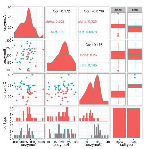
? Are you feeling more in command of the representation of the data?For the dataset enzconc.txt. Generate a plot matrix using ggpairs() in the package GGally.
? What can you learn about the dataset from this small multiple of different plots?
(NB: this may not install on the University PCs: so check out this plot as an example. )For the iris data. Can you take a 2-D scatterplot coloured and faceted by species, but add a background set of ALL data points (in a neutral colour) behind each individual plot? (Hint: you need to create another dataset by dropping the species columnn…)
Take a look at gapminder.
? What is the role of visualisation in this project? How effective do you think this is?Browse the plots at plotly. Can you get inspiration from these visualisations? ? What attributes of a plot do you think contribute to its effectivess?
- Take a look at some of the following (longer) tutorials to get further ideas about how to manipulate the graphical representation of data.
Rmd File.
Rmd File for this workshop.