 d
d
In statistics, we use the term variable to mean a quality or quantity which varies from one member of a sample or population to another. Systolic blood pressure is a variable, which varies both from person to person and from measurement to measurement within the same person. Sex is a variable, people being either male or female.
It is useful to think of data as being of several different types, as the type of data is important in deciding which methods of presentation and analysis we should adopt. The first classification we make is into qualitative and quantitative data.
Qualitative data arise when individuals may fall into separate classes, such as diagnosis or sex. A qualitative variable is also termed a categorical variable or a classification variable.
Quantitative data are numerical, arising from counts or measurements. Wound area is a quantitative variable, as is the length of time until the wound heals, and parity, the number of previous pregnancies which an expectant mother has had. If the values of the measurements can only take a few separate values, often integers (whole numbers), as does parity, those data are said to be discrete. If the values of the measurements can take any number in a range, such as wound area, height, or weight, the data are said to be continuous. In practice, of course, measurements such as height are made to within some degree of precision when reading off a scale. Heights might be recorded to the nearest centimetre, for example, so although there are many possible values, only a finite number can be recorded and height is recorded in a discrete way. However, if the underlying variable is continuous, we can usually ignore the limitations introduced by practical measurement and treat the measurement as continuous, too.
Table 1 shows the source of referral of patients recruited to a randomised controlled trial of physiotherapy compared with advice for the treatment of low back pain (Frost et al., 2004).
| Source of referral: | Frequency | Relative frequency (%) |
|---|---|---|
| General practitioner | 256 | 89.8 |
| Consultant | 18 | 6.3 |
| Triage * | 10 | 3.5 |
| Sports centre | 1 | 0.4 |
| Total | 285 | 100.0 |
Source of referral is a qualitative variable. The count of individuals having a particular quality is called the frequency of that quality in the sample. The proportion of individuals having the quality is called the relative frequency or proportional frequency. Thus the relative frequency of general practitioner referral is 256/285 = 0.898 or 89.8%. The set of frequencies of all the possible categories is called the frequency distribution of the variable.
Table 2 shows a different qualitative variable, mobility of patients with venous leg ulcers recruited to the VenUS I trial (Nelson et al., 2004).
| Mobility | Frequency | Relative frequency (%) | Cumulative frequency | Cumulative relative frequency (%) |
|---|---|---|---|---|
| Walks freely | 238 | 62.1 | 238 | 62.1 |
| Walks with difficulty | 142 | 37.1 | 380 | 99.2 |
| Immobile | 3 | 0.8 | 383 | 100.0 |
| Total | 383 | 100.0 | 383 | 100.0 |
For this variable the categories are ordered. It clear that those who walk freely are more mobile than those who walk with difficulty, who are in turn more mobile than those who cannot walk at all. This was not the case for the source of referral shown in Table 1, where the only order is the order from highest to lowest frequency. There is no other sense in which there is an order general practitioner, consultant, triage, sports centre. This enables us to look at the distribution of mobility in a slightly different way, using cumulative frequencies. The cumulative frequency for a value of a variable is the number of individuals with values less than or equal to that value. Hence the cumulative frequency for patient walks with difficulty is 380, meaning that 380 of the trial subjects could walk to some extent. The relative cumulative frequency for a value is the proportion of individuals in the sample with values less than or equal to that value. The relative cumulative frequency for patient walks with difficulty is 380/383 = 0.992 or 99.2%.
Table 3 shows a discrete qualitative variable, the number of episodes of venous ulcer experienced by the subjects in the VenUS I trial.
| Number of episodes | Frequency | Relative frequency (%) | Cumulative relative frequency (%) |
|---|---|---|---|
| 0 | 11 | 2.9 | 2.9 |
| 1 | 145 | 38.7 | 41.6 |
| 2 | 101 | 26.9 | 68.5 |
| 3 | 39 | 10.4 | 78.9 |
| 4 | 23 | 6.1 | 85.1 |
| 5 | 14 | 3.7 | 88.8 |
| 6 | 9 | 2.40 | 91.2 |
| 7 | 4 | 1.1 | 92.3 |
| 8 | 6 | 1.6 | 93.9 |
| 9 | 1 | 0.3 | 94.1 |
| 10 | 9 | 2.4 | 96.5 |
| 13 | 1 | 0.3 | 96.8 |
| 15 | 1 | 0.3 | 97.1 |
| 17 | 1 | 0.3 | 97.3 |
| 20 | 3 | 0.8 | 98.1 |
| 26 | 1 | 0.3 | 98.4 |
| 29 | 1 | 0.3 | 98.7 |
| 40 | 1 | 0.3 | 98.9 |
| 50 | 3 | 0.8 | 99.7 |
| 64 | 1 | 0.3 | 100.0 |
| Total | 375 | 100.0 | 100.0 |
This is discrete because one either has an episode or one does not, there cannot be a fraction of an episode. Hence the number must be 0 (meaning that the ulcer for which they will be treated in the trial is the first episode), 1, 2, 3, etc. We can count the number of times each possible value occurs to get the frequency distribution, and find the relative and cumulative frequencies as before.
Table 4 shows a continuous qualitative variable, serum cholesterol measured on a sample of stroke patients (Markus et al., 1995).
| 3.7 | 4.8 | 5.4 | 5.6 | 6.1 | 6.4 | 7.0 | 7.6 | 8.7 |
| 3.8 | 4.9 | 5.4 | 5.6 | 6.1 | 6.5 | 7.0 | 7.6 | 8.9 |
| 3.8 | 4.9 | 5.5 | 5.7 | 6.1 | 6.5 | 7.1 | 7.6 | 9.3 |
| 4.4 | 4.9 | 5.5 | 5.7 | 6.2 | 6.6 | 7.1 | 7.7 | 9.5 |
| 4.5 | 5.0 | 5.5 | 5.7 | 6.3 | 6.7 | 7.2 | 7.8 | 10.2 |
| 4.5 | 5.1 | 5.6 | 5.8 | 6.3 | 6.7 | 7.3 | 7.8 | 10.4 |
| 4.5 | 5.1 | 5.6 | 5.8 | 6.4 | 6.8 | 7.4 | 7.8 | |
| 4.7 | 5.2 | 5.6 | 5.9 | 6.4 | 6.8 | 7.4 | 8.2 | |
| 4.7 | 5.3 | 5.6 | 6.0 | 6.4 | 7.0 | 7.5 | 8.3 | |
| 4.8 | 5.3 | 5.6 | 6.1 | 6.4 | 7.0 | 7.5 | 8.6 |
We cannot find a frequency distribution as we did for the number of episodes of venous ulcer. As most of the values occur only once, counting the number of occurrences does not help. There is one 3.6, two 3.8s, one 4.5, three 4.7s, two 4.8s, etc., but no 3.9s, 4.0s,or 4.1s.
To get a useful frequency distribution we need to divide the serum cholesterol scale into class intervals, e.g. from 3.0 to 4.0, from 4.0 to 5.0, and so on. We then count the number of individuals with serum cholesterols in each class interval. We want each serum cholesterol to fall in one and only one of the intervals, so the class intervals should not overlap.
We must decide which interval contains the boundary point to avoid it being counted twice. It is usual to put the lower boundary of an interval into that interval and the higher boundary into the next interval. We do not have to do this, but it is a handy convention and it is worth sticking to unless there is a very good reason not to do so. Thus the interval starting at 3.0 and ending at 4.0 contains 3.0 but not 4.0. We can write this as 3.0 or 3.0 4.0-, the little minus sign indicating up to but not including 4.0, or 3.0 3.999.
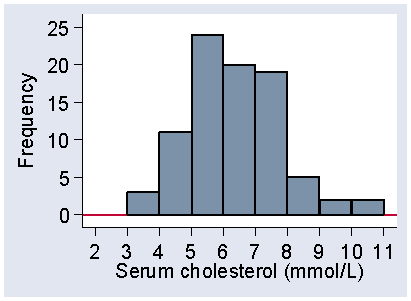
Table 5 shows the frequency distribution that we get if we use an interval size of 1.0 mmol/L and start at 3.0.
| Interval | Tally | Frequency |
|---|---|---|
| 3.0 -- 4.0- | /// | 3 |
| 4.0 -- 5.0- | ///// ///// / | 11 |
| 5.0 -- 6.0- | ///// ///// ///// ///// //// | 24 |
| 6.0 -- 7.0- | ///// ///// ///// ///// | 20 |
| 7.0 -- 8.0- | ///// ///// ///// //// | 19 |
| 8.0 -- 9.0- | ///// | 5 |
| 9.0 -- 10.0- | // | 2 |
| 10.0 -- 11.0- | // | 2 |
| Total | 86 |
Before computers were readily available, people were taught to do this using a tally system to mark off each observation into its correct interval, counting in groups of five. Table 5 shows the appearance of the calculation of a frequency distribution and you will often see this in statistics books. It is very difficult to do accurately and the poor researcher would keep repeating it until the same frequencies were obtained twice. I did this one using a computer and I would recommend any researcher to do the same; our tally marks are just for show.
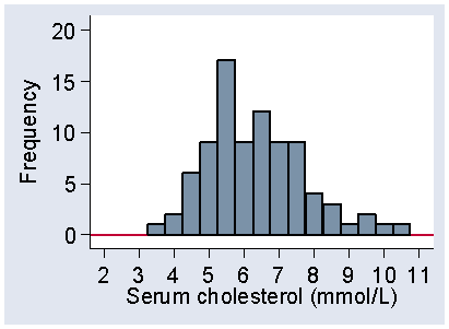
The frequencies shown in Table 5 are only one possible frequency distribution. The choice of intervals of width 1.0 is arbitrary and Table 6 shows the frequency distribution obtained using an narrower interval.
| Interval | Frequency |
|---|---|
| 3.5--4.0- | 3 |
| 4--4.5- | 1 |
| 4.5--5.0- | 10 |
| 5--5.5- | 8 |
| 5.5--6.0- | 16 |
| 6--6.5- | 13 |
| 6.5--7.0- | 7 |
| 7--7.5- | 10 |
| 7.5--8.0- | 9 |
| 8--8.5- | 2 |
| 8.5--9.0- | 3 |
| 9--9.5- | 1 |
| 9.5--10.0- | 1 |
| 10--10.5- | 2 |
| Total | 86 |
The frequencies are different. We could choose a different staring point for our interval, too. We could have intervals staring at 3.45 with width 0.92 if we wanted to, the choice is for convenience rather than because there is a single correct set of intervals. For continuous data the individual frequencies do not mean very much. It is the distribution, the set of all the frequencies together, which carries the information.
Because most people find it very difficult to get much useful insight from a column of frequencies like those shown in Tables 5 and 6, we usually view them not as numbers but as a picture, such as a histogram, described in the next section.
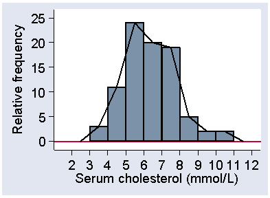
A histogram is a graph showing a frequency distribution. Figure 1 shows the histogram for Table 5.
Figure 1. Histogram of serum cholesterol, frequency scale
d
The variable, serum cholesterol, is shown along the horizontal axis and the frequency on the vertical axis. Each interval has a rectangular bar over it, the height of which represents the frequency, the number of observations which fall in that interval.
Figure 2 shows another histogram for the same data.
Figure 2. Histogram of serum cholesterol using a starting point of 3.25 mmol/L
and an interval of 0.5 mmol/L, frequency scale
 d
d
The interval width is 0.5 mmol/L, as in Table 6, but I have also changed the starting point from 3.0 to 3.25. Although the frequencies are different, the shapes of the two histograms are similar. Both have low frequencies for small cholesterols, bigger frequencies as we move along the axis, peaking between 5 and 6, and then declining as cholesterol increases, with no observations beyond 11 mmol/L. As we shall see, it is the shape of the distribution which is important. However, Figure 1 is more even than Figure 2, which is quite bumpy by comparison. This is because the intervals are smaller and so the frequencies in them are smaller, which makes them more prone to random fluctuations. We usually try to choose an interval size which makes the shape of the distribution most clear.
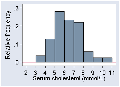
We do not have to plot frequency on the vertical axis, and Figure 3 shows the distribution in Figure 1 with relative frequency on the vertical axis instead.
Figure 3. Histogram of serum cholesterol, relative frequency scale
 d
d
The scale shows the proportion of observations within each interval rather than the number. This makes it easier to compare histograms for samples with very different numbers of observations.
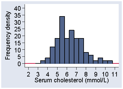
Another way to draw the histogram is to use frequency density. Figure 4 shows the frequency distribution from Figure 2 using the frequency density scale.
Figure 4 Histogram of serum cholesterol for the distribution of
Figure 2, frequency density scale
 d
d
Instead of showing the frequency in the interval, we show the frequency per mmol/L of serum cholesterol. In other words, we show the number of observations per unit of the variable. The frequency density is the frequency divided by the width of the interval. In Figure 2 and Figure 4, the intervals have width 0.5, so the frequency densities are twice the size of the frequencies and the vertical scale in Figure 4 goes correspondingly higher. This means the frequency for an interval is found by multiplying the frequency density by the width of the interval. This means that the frequency between two serum cholesterol values is represented by area under the histogram between those values. For the interval 3.75 to 4.25- mmol/L, the frequency density is 4 observations per mmol/L. The width of the interval is 0.5 mmol/L, so the frequency is 4 × 0.5 = 2, as can be confirmed from Table 4. If we plot the relative frequency density, the proportion of observations per unit of the variable, the total area under the histogram is 1.0.
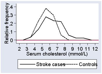
Sometimes we use a variation of the histogram, where we show the distribution as a line graph. We join the tops of the bars in the histogram, as shown in Figure 5, to make a frequency polygon.
Figure 5. Histogram of serum cholesterol for stroke cases with
frequency polygon superimposed
 d
d
This is good for showing more than one distribution on the same axes.
Figure 6 shows the serum cholesterol for the stroke patients and for the healthy controls.
Figure 6. Frequency polygons showing the distribution of serum cholesterol
for stroke cases and for healthy controls.
 d
d
Not surprisingly, the stroke patients tend to have higher serum cholesterols, as raised serum cholesterol is a well-known risk factor for cardiovascular disease. The graph is quite informative, as it shows us that the stroke patients were also more variable and that some had cholesterol values as low as the lowest for the controls.
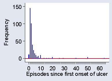
When we draw a histogram for a discrete variable, such at the number of ulcer episodes shown in Table 3, we may separate the different values to remind ourselves and our readers that this is indeed a discrete variable and that intermediate values, such as 2.3 episodes, would be meaningless. Figure 7 shows a histogram for the data of Table 3.
Figure 7. Histogram for a discrete variable, number of episodes of venous ulcers
 d
d
I have said that for a quantitative variable it is the shape of the distribution which is important. To describe this, we highlight two aspects of the distribution: the mode and the tails. The mode is the most frequently occurring value in the distribution. For Table 3 it is easy to see that the mode is one episode, which was reported for 145 of the 375 subjects.
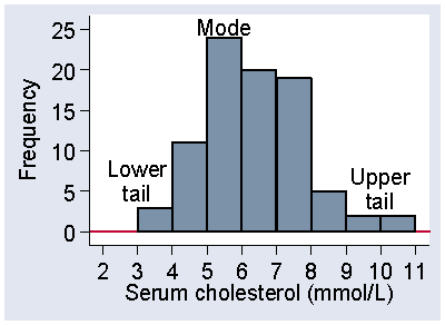
For continuous data the mode is more difficult to determine from a sample. For the data of Table 4, the most frequently occurring cholesterol is 5.6, but there were 7 observations for the 86 subjects. Rather than the modal observation, we think about the modal class, the interval in which the largest number of observations lie. For Figure 1, this is the interval 5.0 to 6.0, which includes 24 observations. The mode is in the middle of the distribution, where observations are usually frequent. The tails are the places are the extremes of the distribution, where observations are usually sparse. Figure 8 shows the mode, i.e. the modal class, and the upper and lower tails of the distribution of serum cholesterol in stroke patients.
Figure 8. The mode and tails of a distribution
 d
d
The distributions shown in Figure 1, Figure 6, and Figure 7 each have one obvious mode. We call a distribution with one mode unimodal.
Sometimes we have a distribution which has more than one mode. For example, Figure 9 shows systolic blood pressure for a sample of subjects from a very different population to the normal subjects in Figure 6.
Figure 9. Systolic blood pressure in 251 patients admitted to an intensive therapy unit
(data of Friedland et al., 1996)
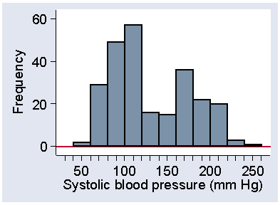 d
d
These were patients on admission to an intensive therapy unit (Friedland et al., 1996). In the sample of normal subject, there was clear modal class at 120 to 140 mm Hg. In Figure 9, the frequency between 120 and 140 is very low and the peak is between 100 and 120. However, there is a second, lower peak between 160 and 180. What is happening here is that we have a sample of very sick people, sick enough to need intensive care, but there are many different reasons for this need. In fact, among these 251 patients there were 77 different diagnostic categories. In some cases their condition lowers blood pressure below normal, in others it raises it above normal. Relatively few have what we would regard as optimum systolic pressure.
Although 100 to 120 mm Hg is the most frequent interval in Figure 9, and is therefore the mode as defined above, the second peak at 160 to 180 is called a second mode for the distribution. We call this distribution shape bimodal. Distributions with more than one mode are very unusual in healthcare data and when we see one we should suspect that there is more than one population mixed together. We only regard the distribution as bimodal if there is a clear separation of the peaks, as in Figure 9. Irregular bumps as seen in Figure 4 and Figure 5 do not qualify as separate modes. Almost all the distributions we shall see are unimodal.
Much more interesting than the number of modes are the sizes and shapes of the tails of the distribution, the parts of the histogram near the extremes. Figure 10 shows the distribution heights of 222 women admitted to the VenUS I trial.
Figure 10. Heights of 222 women admitted to the VenUS I trial
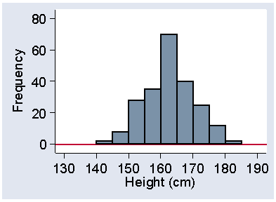 d
d
In this distribution the two tails are of very similar size and shape. If the tail on the right is of similar length to the tail on the left, the distribution is said to be symmetrical. The tails need only be approximately the same; the exact shape depends on our choice of starting point and interval size in any case.
If the tail on the right is longer than the tail on the left, as in the distributions shown in Figure 1, Figure 6, and Figure 7, the distribution is skew to the right or positively skew. If the tail on the right is longer than the tail on the left, the distribution is skew to the left or negatively skew. These names often bother people because they feel, very reasonably, that if most of the observations are on the left hand side the distribution should be called skew to the left. However, the convention is that the direction of the skew is in the direction of the long tail and we are stuck with it.
Negatively skew distributions are much less common than are positively skew distributions. They do exist, however, and Figure 11 shows one: gestational age at birth.
Figure 11. Gestational age at birth for 1749 babies
(data of Brooke et al., 1989)
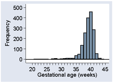 d
d
This may be artificially skew, in that babies who would be born in the upper tail are delivered after obstetric intervention, for their own safety and that of their mothers.
Most medical data follow either a symmetrical or positively skew distribution. The shape of the distribution is an important guide to the methods of analysis which we can use.
For qualitative data the frequency distribution can be presented as a convenient percentage or table of percentages, which usually have a straightforward interpretation. There is nothing else to be done before we present or analyse them.
For quantitative data, the frequency distribution is not a very handy thing and we cannot present our data in the form of page after page of histograms. We shall now look at how we summarise the data to make them easier to interpret and analyse. We do this by calculating summary numbers such as averages. We call these summary statistics. We use the word statistic is anything calculated from the data alone.
In healthcare research, we are using our observations as a sample, which we hope will tell us something about a wider population. The summary statistics we calculate, such as averages, are used to estimate the corresponding values for this wider population, the population from which our sample was drawn and which it represents. For this reason our choice of what statistics to calculate is guided by whether they estimate the population value and how little they vary from sample to sample.
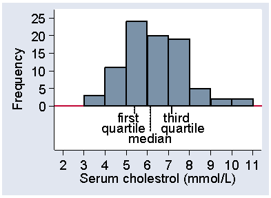
The median is one of the simplest summary statistics to calculate. The median is the central value of the distribution, such that half the observations are less than or equal to it and half are greater than or equal to it. For example, consider the serum cholesterol measurements on a group of stroke patients shown in Table 4. There are 86 observations, so the middle of the distribution will be between the 43rd and 44th observations. 43 will be below this and 43 above. The observations in Table 4 are arranged in ascending order in columns of 10, so it is easy to see where the observations numbered 43 and 44 are, in the fifth column. They are 6.1 and 6.2 mmol/L. We regard the centre of the distribution as being midway between them: 6.15 mmol/L. If we have an odd number of observations, the median is the central value and is equal to an actual observation. For an even number of observations, the median may not be an actual observation.
Two other statistics which we use to summarise a distribution are the first and third quartiles. The first quartile is the value which cuts off the lowest quarter of the distribution. For 86 observations, one quarter of them is 86/4 = 21.5, so the first quartile will be midway between the 21st and 22nd observations. These are 5.4 and 5.4, so the first quartile is 5.4 mmol/L. The third quartile has three quarters of the distribution below is and one quarter above, so is at the 86×3/4 = 64.5 observation. The 64th and 65th serum cholesterol measurements are 7.1 and 7.2, so the third quartile is 7.15 mmol/L.
There are actually three quartiles which divide the distribution into four equal parts. The first quartile has one quarter of the observations below it, the third quartile has three quarters of the observations below it. The second quartile must have two quarters, i.e. one half, of the observations below it. The second quartile is the median. Figure 12 shows the positions of the quartiles on the histogram.
Figure 12. Histogram of serum cholesterol among 86 stroke patients,
showing position of the three quartiles
 d
d
There are only three quartiles which divide the distribution into four parts, which we should call quarters. These are often misleading called quartiles, too. You will hear of people in the top quartile. This usage is so common that the distinction between the dividing points and the sets of values is becoming lost.
The quartiles are not the only way we can divide up the distribution. We often divide the distribution into 100 equal parts at the centiles or percentiles. We talk of the point which cuts of 20% of the observations as the 20 centile or 20th percentile. There are only 99 centiles and there is no 100th centile. This would be above all the observations (100%) and we usually have no idea where this would be. The median is thus the 50th centile, the first quartile is the 25th centile, and the third quartile is the 75th centile.
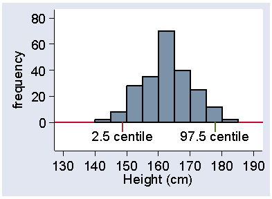
The centile number does not have to be an integer. We often talk about the 2.5th centile, for example. This means the value below which we estimate 2.5% of subjects to lie. This does not mean much for the cholesterol data, because there are only 86 observations, but it does for the heights of women in the VenUS I trial, of whom there were 222. 2.5% of this is 222×2.5/100 = 5.55, so we need the 5th and 6th observations. These were 147.32 and 149.86 cm, the odd values being because these were converted from inches. The 2.5 centile will be approximately the midway point between these, which is 148.6 cm. In the same way, the 97.5 centile will be between the 216th and 217th observations, which were both 177.8 cm, so this is the centile. Figure 13 shows these centiles marked on a histogram.
Figure 13. Histogram of heights of 222 women admitted to the VenUS I trial
showing the 2.5 and 97.5 centiles
 d
d
Between them lie 95% of the observations.
We sometimes use tertiles, which divide the distribution into three equal parts and quintiles which divide the distribution into five equal parts. There are, of course, two tertiles and four quintiles. We call all of these division points quantiles, defined as values which divide the distribution such that there is a given proportion of observations below the quantile.
The median is one way to identify the middle of a distribution, but it is not the only one. More often, we use the arithmetic mean or average, usually referred to simply as the mean. This is found by taking the sum of the observations and dividing by their number. For the cholesterol data, the sum is 545.3 mmol/L. Dividing by the number of observations, 86, gives the mean, 6.34 mmol/L.
The mean and median are both summary statistics which give a numerical value to the middle of the distribution. They are called measures of central tendency. There are many others which can be devised, but only one is much used in healthcare research. This is the geometric mean. We shall meet it in the lecture on transformations.
The sample mean has two advantages over the median as a measure of the middle of the distribution. First, the mean uses all the data equally, that is, each observation carries equal weight in its calculation. For the median, observations at the extremes have very little effect on the median and can be changed quite a lot without the median being changed. This means that the mean uses the information more efficiently than the median and so it varies less from sample to sample than does the median. We shall look at this again in the lecture on estimation. Second, the mean has much more convenient mathematical properties which makes it much easier to compare the means of different groups than it is to compare the medians of different groups. On the other hand, the lack of effect of extreme observations on the median make it preferable to mean sometimes as a summary statistic to describe data, especially when there are extreme observations. The median is a very useful descriptive statistic, but not much used for other purposes.
The mean for the cholesterol data, which have a positively skew distribution, was 6.34 mmol/L. Compare this with the sample median, 6.15 mmol/L. They are not the same, the mean being slightly larger. However, for the 222 heights, which have a symmetrical distribution, the mean is 162.2 cm and the median 162.6 cm, differing only in the fourth figure. In general, If the distribution is symmetrical the sample mean and median will be about the same. Indeed, if the distribution were exactly symmetrical, for every observation above the median there would be an observation below the median the same distance from it. The average of the pair would be the median, and so the average for all the pairs of observations would be the median also.
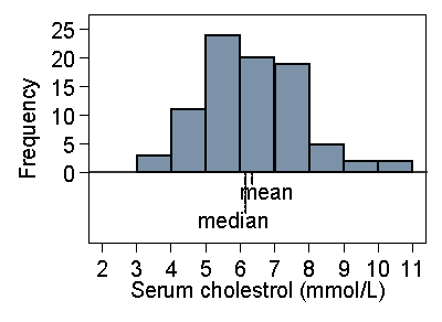
In a skew distribution the mean and the median will usually be different. If the distribution is skew to the right, as for serum cholesterol, the mean will usually be greater, if it is skew to the left the median will usually be greater. This is because the values in the tails affect the mean but not the median. Figure 14 shows the cholesterol data with the positions of mean and median on the histogram.
Figure 14. Histogram of serum cholesterol in stroke patients,
showing position of median and mean
 d
d
If we were to change the data by increasing the largest observation this would pull the mean higher, but it would not affect the median. Hence if the distribution is very skew to the right, we would expect the mean to exceed the median. For the very skew distribution of number of previous episodes of venous ulcer (Figure 7) the median is 2 episodes (easily seen from Table 3) and mean is 3.8 episodes. If the distribution is negatively skew, with the long tail on the left, the median is usually greater than the mean.
You will often seen it said that the median is always less than the mean for a positively skew distribution and greater for a negatively skew distribution. This is not true, but it is usually the case for the distributions encountered in healthcare research. What we can say is that a substantial difference between the median and mean is an indicator that there is skewness present.
The mean and median are measures of the central tendency or position of the middle of the distribution. We shall also need a measure of the spread, dispersion or variability of the distribution. How much do our subjects differ from one another?
An obvious measure of variability is the range, the difference between the highest and lowest values. This is a useful descriptive measure, but has two disadvantages. First, it depends only on the extreme values and so can vary a lot from sample to sample. Second, it depends on the sample size. The larger the sample is, the further apart the extremes are likely to be. No matter how big the biggest member of the sample is, sooner or later we will find a bigger one, and no matter how small the smallest is, sooner or later we will find a smaller one. For these reasons, we never use the range, although as a descriptive statistic we often quote the minimum and maximum values. For example, for the serum cholesterol measurements in stroke patients the minimum is 3.7 and the maximum is 10.4 mmol/L. This would usually be quoted as Range (3.7 to 10.4) or (3.7 - 10.4). Dashes can be confused with minus signs, so I usually prefer to. Ranges are often used in the presentation of baseline descriptive data of subjects recruited to a study.
We can get round some of the problems of the range by using the interquartile range or IQR, the difference between the first and third quartiles. For the cholesterol, as we have seen, the first and third quartiles are 5.4 and 7.15 mmol/L, so the interquartile range is 7.15 5.4 = 1.75 mmol/L. As with the range, this is almost always used purely as a descriptive statistic and quoted as IQR (5.4 to 7.15) rather than as the actual difference. It is a useful descriptive measure, but very difficult to use for any further statistical calculations. Another range often calculated is the range between the 2.5 centile and the 97.5 centile. This will include the central 95% of the observations and we call it a 95% range. It is not used often as a descriptive statistic, because we need quite a large sample to calculate it. For the height data, we had 222 women and can calculate this directly as 148.6 to 177.8 cm, as described in the discussion of centiles above. We see below how we can estimate this more reliably from the mean and standard deviation, even using quite small samples.
If the mean or the median is near to one end of the range or interquartile range, this tells us that the distribution must be skew. If the mean or median is near the lower limit it will be positively skew, if near the upper limit it will be negatively skew.
For use in the analysis of data, range and IQR are not satisfactory. Instead we use two other measures of variability: variance and standard deviation. These both measure how far observations are from the mean of the distribution.
If we subtract the mean from each observation, we a new set of numbers which we call the deviations from the mean. If many of these are large then the observations will be very variable, if most of them are small then the observations will have little variability. We might think that the average of these deviations would be a good measure, but it is not. Some of the observations will be greater than the mean and will have positive deviations, some will be less than the mean and will have negative deviations. When we add them all together, we get exactly zero, whatever the data are like. We could just ignore the signs and take them all as positive (what we call the absolute values) but this leads to mathematical difficulties and turns out not to be very helpful for statistical analysis. Instead, we get rid of the signs in a different way: we square the deviations. Now we can add the squared deviations and get a positive number which we call the sum of squares about the mean. We often abbreviate this to sum of squares. The sum of squares about the mean will be big for highly variable data and small for data with little variability. It also has mathematical properties which are much more convenient for statistical analysis.
This sum of squares about the mean will clearly also depend on the sample size and we want an average, not the a sum. We would like to divide by the number of observations. This is where we hit a snag. If we have only one observation, we cannot do this. The mean is equal to the lone observation and the difference is zero. The average deviation from the mean will always be zero for a single observation. We need at least two observations to estimate variability. This is fairly obvious, but it points up a difficulty. The sum of squares about the sample mean cannot be proportional to the sample size, because at sample size = one the sum of squares is always zero. In fact, the sum of the squared differences from the mean is proportional to the number of observations minus one, not the number of observations. (Bland, 2000, goes into some detail about why this is.) We therefore estimate the variance as the average squared difference from the mean, the sum of squares about the mean divided by the number of observations minus one. We call the number of observations minus one the degrees of freedom for the variance. The sample variance is estimated as the sum of the squared differences from the mean divided by the degrees of freedom.
For the height data the variance is 49.7 square cm. It is in square cm because to get it we subtracted the mean (cm) from the height (cm) to give the deviation (cm). We squared these to give square cm and summed them to get the sum of squares (square cm). We divided by a pure number, the degrees of freedom, which has no units, so we finished with a variance in square cm.
The variance is based on the squares of the observations and so is in squared units. This makes it difficult to interpret. If the variance of height = 49.7 square cm is difficult, how much more so is the variance of the serum cholesterol, which is 1.96 square millimoles per square litre, whatever they may be. For the number of episodes of venous ulceration, the variance is 42.3 square episodes, an even more bizarre concept.
If we take the square root of the variance, this will then have the same units as the original observations. The square root of something in square cm is in cm, the square root of square millimoles per square litre is in mmol/L. The square root of the variance is called the standard deviation or SD, usually denoted by s. For the heights it is root 49.7 = 7.1 cm. For the serum cholesterol the standard deviation is root 1.96 = 1.40 mmol/L. For the episodes of ulceration the standard deviation is root 42.3 = 6.5 episodes.
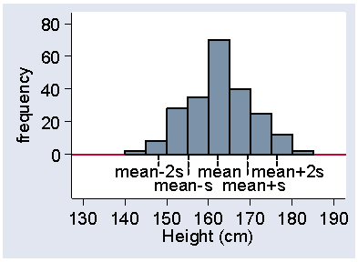
The standard deviation is quite a good descriptive statistic. For most distributions the majority of observations (usually about 2/3) fall within one SD of mean. Almost all fall within about two SD of mean (usually about 95%). For example, Figure 15 shows the heights of women in the VenUS I trial with the positions of the mean, the mean plus or minus one standard deviation, and the mean plus or minus one standard deviation marks.
Figure 15. Histogram of female height showing position of mean and
mean ± 2 standard deviations
 d
d
We can see that about two thirds of the observations lie within one standard deviation on either side of the mean. In fact, 65% of the heights lie between these limits. Most of the heights appear in Figure 15 to fall within two standard deviations of the mean, in fact it is 94% in this sample. The mean minus two standard deviations is 148.1 cm, which is very close to the 2.5 centile, 148.6 cm. Similarly, the mean plus two standard deviations is 176.3 cm, very close to the 97.5 centile, which is 177.8 cm.
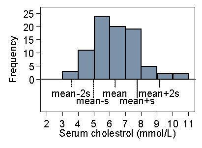
Figure 16 shows the same thing for the serum cholesterol.
Figure 16. Histogram of serum cholesterol in stroke patients showing
position of mean and mean ± 2 standard deviations
 d
d
The picture is quite similar. Of the 86 observations, 4 = 5% are outside two standard deviations from the mean, though all four of them are above the upper limit. 58% are within one standard deviation of the mean. This is typical of a positively skew distribution, that about 95% of observations are within two standard deviations from the mean, but the 5% outside the limits tend to be at the high end.
Figure 17 shows a much more positively skew distribution, for the duration of venous leg ulcers prior to admission to the VenUS I trial.
Figure 17. Histogram of duration of venous ulcer showing position of mean
and mean ± 2 standard deviations
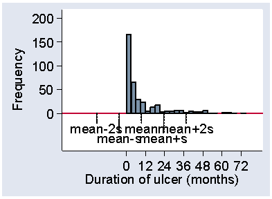 d
d
Here the standard deviation, 14.0 months, is actually bigger than the mean, 9.4 months. The mean minus one standard deviation is therefore a negative number and no observations can be below it. The 87% observations within one standard deviation from the mean therefore include the smallest. There are 7% of observations more than two standard deviations above the mean and 93% within the limits. We can use this as a handy check for skewness in a published paper. If the variable must be positive, like most measurements, and the mean is less than two standard deviations, then the distribution must be positively skew. Otherwise, we would expect 2½% of the observations to be negative. (These rules of thumb for skewness only work one way, e.g. the mean may exceed two standard deviations and the distribution may still be positively skew, as for the serum cholesterol data.)
Finally, Figure 18 shows the same thing for the negatively skew gestational age.
Figure 18. Histogram of gestational age at birth showing
position of mean and mean ± 2 standard deviations
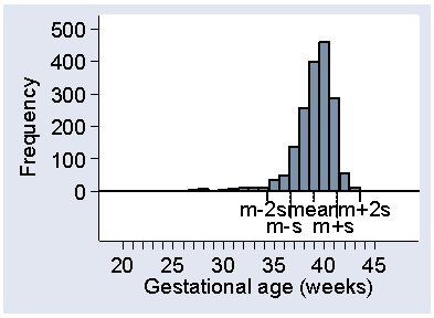 d
d
This time the observations more than two standard deviations from the mean are nearly all small. Only 2 out of 1749 observations are more that two standard deviations above the mean, with 62 below, making 64/1749 = 4% altogether.
To sum up, the majority of observations (usually about two thirds) are expected to be within one standard deviation from the mean. Almost all observations (usually about 95%) are expected to be within about two standard deviations from the mean, but those outside may all be at one end.
Variance and standard deviation use all the data equally, unlike ranges, and so use the data most efficiently. This is why we use them as our first choice methods of measuring variability.
Martin Bland
18 April 2006
Bland M. (2000) An Introduction to Medical Statistics. Oxford, University Press.
Brooke OG, Anderson HR, Bland JM, Peacock JL, Stewart CM. (1989) Effects on birth weight of smoking, alcohol, caffeine, socioeconomic factors, and psychosocial stress. British Medical Journal, 298, 795-801.
Friedland JS, Porter JC, Daryanani S, Bland JM, Screaton NJ, Vesely MJJ, Griffin GE, Bennett ED, Remick DG. (1996) Plasma proinflammatory cytokine concentrations, Acute Physiology and Chronic Health Evaluation (APACHE) III scores and survival in patients in an intensive care unit. Critical Care Medicine 24, 1775-81.
Frost H, Lamb SE, Doll HA, Carver PT, Stewart-Brown S. (2004) Randomised controlled trial of physiotherapy compared with advice for low back pain. British Medical Journal 329, 708-711.
Markus HS, Barley J, Lunt R, Bland JM, Jeffery S, Carter ND, Brown MM. (1995) Angiotensin-converting enzyme gene deletion polymorphism: a new risk factor for lacunar stroke but not carotid atheroma. Stroke 26, 1329-33.
Nelson EA, Iglesias CP, Cullum N, Torgerson DJ. (2004) Randomized clinical trial of four-layer and short-stretch compression bandages for venous leg ulcers (VenUS I). British Journal of Surgery 91, 1292-1299.
To Introduction to Statistics for Research index.
This page maintained by Martin Bland.
Last updated: 15 January, 2020.