- Size text using keywords, percentages, and ems to allow more user control.
- Plan for vertical expansion of horizontal page components.
- Use floats to achieve grid-like results.
- Ensure that content is still readable in the absence of images or CSS.
- Strip the presentation from data tables, and rebuild with CSS.
- Progressively enhance your designs using HTMls and CSS3.
- Visit the companion website at simplebits.com/bulletproof to download finished files, additional resources, and book updates
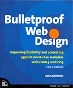
This is a useful book. It not only tells you how to use various HTML5 and CSS3 facilities, it more importantly tells you when, where, and why to use them, to achieve a robust website. It takes as central the mantra of separating design from content, and demonstrates how following that approach makes the website design not only more robust to browser differences, but more maintainable, and more accessible. The design guidance is possibly more helpful that the lower level details. The chapter on text sizing alone should be read by all web site designers. (Don’t you just hate going to a web site with teeny teeny text, trying to increase the font size, yet nothing happens? No? Well, wait ’til you get a bit older, then!)
Initially, I found that the discussion assumed somewhat more knowledge of CSS than I had at the time. But as I worked my way through the well-designed descriptions, I found I was understanding more about that, as well. I’ve used some of the ideas to help improve (I hope!) various aspects of my own web site.
