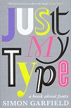
A fun jaunt through the world of typefaces, many of which, to my untrained eye, are virtually indistinguishable.
'We don't serve your type.'
There's some interesting history, both of printing, and of type face design through the centuries. It really brought home to me how much computers have changed everything: to own a printing press, you also needed to own a full set of type, laboriously carved from metal, which, in different sizes and weights, would be expensive (and heavy!). Although printing press allowed many copies of books to be made, there weren't many printing presses. Nowadays nearly anyone can set up a "print on demand" press. (But no mention of Knuth, Computer Modern, or MetaFont.)
One thing that's fun to realise is that many of the "modern" typefaces arose in the 1930s.
To accompany the readable style, I would have liked more pictures of the typefaces. Sometimes there is only a word or two, often not representing the points made in the text (such as talking of the gorgeous bowl to the "g", then illustrating said face with a word containing no g's). So, a fun romp through more typefaces than seem strictly necessary, but somewhat lacking in detail.

