Edward Tufte's superb books show how to design graphics that are information rich, that aren't mere 'chartjunk'. A must for anyone who wants to present data graphically.
Be warned! After reading these, you will hardly ever be able to look at a graph or chart without mentally shuddering, and redrawing it. And as for those automatic chartjunk generators, called 'corporate presentation graphics' packages, you will use them very differently.
Tufte describes the evolution of statistical graphics, and demonstrated the difference between 'good' and 'bad', with numerous suitably 'graphic' examples of each.
Graphics should show large amounts of data; graphics should be dense. Exploit the resolving power of the eye and the pattern recognition of the brain. With bad design, the data can be obscured; but with good design, more than simple x-y relations can be shown. Plot multiple dimensions (Napoleon's Russian campaign graphic shows six!); make the axes show part of the data (range, quartiles); use stem-and-leaf plots, Chernoff faces...
Every drop of ink should be there to show the data. Axis ink can often be made to serve multiple purposes with clever design. Removing ink can often make the data more clearly visible. No more chartjunk, no more grid junk, no more fake perspective, no more garish colours -- just cool, clear, crisp graphics presenting masses of information.
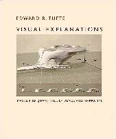
This book continues Tufte's fight against chartjunk. Now the emphasis is more on the display of non-quantitative (categorical) data, again, lavishly illustrated with the best (and worst!) examples.
Good graphics should have both a macro reading (global, or summary, information available at a glance) and a micro reading (local, or detailed, information available on closer reading). Just like a geographical map, or a stem-and-leaf plot.
Tufte starts his third crusade with a chapter on the importance of scale and context. He illustrates this with his redrawing of a thunderstorm animation (featured on the cover): the original has lost its dimensions, in particular, the fact that the vertical scale is exaggerated by a factor of two. He also has harsh words for the spectacular video of the Venus flyover, constructed from radar data, where the vertical scale is multiplied by a factor of 22.5, with no indication of this fact to be found anywhere on screen. (This enormous misrepresentation even led to a call for a "Flat Venus Society"!)
Next he moves on to praising John Snow's famous map of the cholera epidemic death data around the Broad Street pump, London, 1854, that provided the first proof that cholera was spread in contaminated water. Tufte explains in painstaking detail everything that Snow did right, and how subsequent generations have failed to emulate him, from sloppy copying of the original cholera map, to sloppy collection and representation of their own data.
In particular, he discusses at great length the infamous O-ring flaw that led to the Challenger space shuttle explosion on 28th January 1986. The data to explain the effect of temperature on the O-rings was available well before the launch, but was never presented in a way that made the problem apparent (let alone obvious). Here I don't know whether to be impressed at the simple clarity and persuasiveness (even with the benefit of 20-20 hindsight) of the graph Tufte presents, or just plain horrified by the crudity of the original "explanations".
In an amusing section on magic tricks, Tufte analyses how they work, and so how not to present comprehensible explanations. Such things as: never explain what you are going to do; never do the same trick twice; obscure small important movements with large unimportant ones.
The final part of the book covers confections, or "assemblies of many visual elements" that "illustrate an argument" and "present and enforce visual comparisons". He illustrates this theme with engravings from the frontispieces of old books. I think I may have missed the point of this part of the book. Some of the drawings are very pretty and clever, but they take a kind of artistic skill not possessed by many. From the rest of Tufte's teachings I have learned to draw better graphs and diagrams, to think more critically about the design of my data displays, and to notice better when others' displays are confusing or misleading. But I'm not sure what I can do with this last section.
No matter. Like his previous books, Visual Explanations contains wonderfully thought-provoking (and in the case of Challenger, heart-breaking) examples: a beautiful addition to his series. My only worry: will we have to wait another 7 years for volume 4? Even if we do, I'm sure it will be worth it.
The fourth book in Tufte's wonderful series about the presentation of data (and a fifth is promised). Here he concentrates on the task of presenting evidence in a clear, comprehensible, professional, thoughtful, and always beautiful, manner. Evidence can comprise text, tables, charts, diagrams, pictures, and they should be interwoven into a harmonious compelling whole. Chartjunk, and books that banish all their figures to the end, come in for withering critique.
But what comes in for the most withering critique of all is Microsoft's PowerPoint, mainly as concerned with the presentation of evidence about the Colombia shuttle crash. (I sincerely hope that not all of Tufte's books will from now on deal with evidence surrounding shuttle crashes...) It appears that little, or nothing, has been learned about presenting evidence since his earlier discussion of the Challenger disaster. I admit, I was initially puzzled by the amount of venom heaped on PowerPoint slides -- until I realised that these were the sole medium used to present the information -- no technical reports, no charts or graphs, no carefully reasoned arguments; not even, in many cases, an accompanying presentation. Just low density bulletted grunts. This practice is so stupid I fail to comprehend how anyone could think it a good idea. The committee investigating the crash felt the same, as again did the committee investigating the later return to space. Tufte rails against PowerPoint's complete inadequacy as a medium for presenting "beautiful evidence" (and check out the brilliant six PP slide Gettysburg Address as produced by the Content Wizard!)
There's lots of good stuff here -- Galileo's observations of Jupiter's moons, the famous map of the disastrous Russian Campaign of 1812, and the introduction of "sparklines" to display time series data as "words" in the text, along with some intriguing redrawing of datasets. All good stuff. But not, I feel, as good as previous books -- the information content feels less dense, and there is some repetition. But still eminently worth reading -- and taking note of. And as far as PowerPoint goes for presenting evidence, all I can say is: No! Wrong! Totally wrong! Where'd you learn this? Stop doing it!