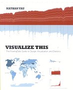
Yau provides a comprehensive introduction to data visualisation: why you want to do it, what kinds of approaches are available, and how to use them in detail.
This is a combination of data analysis – what story does the data tell? – and graphic design – what visual approach to use to tell the story convincingly and attractively. So we get told about the usual histograms and line charts and scatter plots, and explained the less usual heat maps and Chernoff faces and parallel coordinates, all told in the context of what you are trying to show about the data. We get told how to scrape data off websites, with example code. We get worked examples in Python, JavaScript and R to draw the charts shown, and explanations of how to change the defauls to get better design. We get discussions of outliers, and what to do about them.
Given how much Yau emphasises the need to make the area (rather than the radius) of a circular blob proportional to the data quantity it represents, to avoid visual bias, I am surprised that he doesn’t give similar clear warnings about choropleth maps (those where each country, or other region, is coloured to represent the data for that region). Different countries have different sizes, which can again bias the visual effect.
Apart from this one minor caveat, this is an excellent introduction to visualisation. The reader can hit the ground running, and produce beautiful chartjunk-free charts that tell the story of the data clearly, without misrepresenting it.

