
We often want to summarize a frequency distribution in a few numbers, for ease of reporting or comparison. The most direct method is to use quantiles. The quantiles are values which divide the distribution such that there is a given proportion of observations below the quantile. For example, the median is a quantile. The median is the central value of the distribution, such that half the points are less than or equal to it and half are greater than or equal to it. We can estimate any quantiles easily from the cumulative frequency distribution or a stem and leaf plot. For example, the following data are measurements of Forced Expiratory Volume in one second (FEV1) for 57 male medical students:
2.85  3.19  3.50  3.69  3.90  4.14  4.32  4.50  4.80  5.20
2.85  3.20  3.54  3.70  3.96  4.16  4.44  4.56  4.80  5.30
2.98  3.30  3.54  3.70  4.05  4.20  4.47  4.68  4.90  5.43
3.04  3.39  3.57  3.75  4.08  4.20  4.47  4.70  5.00
3.10  3.42  3.60  3.78  4.10  4.30  4.47  4.71  5.10
3.10  3.48  3.60  3.83  4.14  4.30  4.50  4.78  5.10
For these FEV1 data the median is 4.1, the 29th value in the Table. If we have an even number of points, we choose a value midway between the two central values.
In general, we estimate the q quantile, the value such that a
proportion q will be below it, as follows. We have n ordered
observations which divide the scale into n + 1 parts: below the
lowest observation, above the highest and between each adjacent pair. The
proportion of the distribution which lies below the i th observation
is estimated by i / (n + 1). We set this equal to q and
get i= q ( n + 1). If i is an integer, the
ith
observation is the required quantile estimate. If not, let
jbe
the integer part of i , the part before the decimal point. The quantile
will lie between the j th and j + 1 th observations. We estimate
it by
x j + ( x j+1 -
xj)
times (i - j)
For the median, for example, the 0.5 quantile,
i = q ( n +1) = 0.5 times (57+1) = 29, the 29th
observation as before.
Other quantiles which are particularly useful are the quartiles of
the distribution. The quartiles divide the distribution into four equal
parts, called fourths . The second quartile is the median. For the
FEV1 data the first and third quartiles are 3.54 and 4.53. For the first
quartile,
i = 0.25 times 58 = 14.5. The quartile is between the
14th and 15th observations, which are both 3.54. For the third quartile,
i=0.75 times 58 = 43.5, so the quartile lies between the 42nd and 43rd observations,
which are 4.50 and 4.56. The quantile is given by
4.50 + (4.56 - 4.50) times (43.5 - 43) = 4.53.
[Edward McNeil has pointed out an error here, which is in the book. If i = 0.75 times 58 = 43.5, then the quartile lies between the 43rd and 44th observations, not 42nd and 43rd as I had it. The calculation is correct -- I hope! Many thanks.]
We often divide the distribution at 99 centiles or percentiles . The median is thus the 50th centile. For the 20th centile of FEV1, i =0.2 times 58 = 11.6, so the quantile is between the 11th and 12th observation, 3.42 and 3.48, and can be estimated by 3.42 + (3.48 - 3.42) times (11.6 - 11) = 3.46.
We can also estimate these easily from the cumulative frequency polygon:
We find the position of the quantile on the vertical axis, e.g. 0.2 for the 20th centile or 0.5 for the median, draw a horizontal line to intersect the cumulative frequency polygon, and read the quantile off the horizontal axis.
Tukey (1977) used the median, quartiles, maximum and minimum as a convenient five figure summary of a distribution. He also suggested a neat graph, the box and whisker plot , which represents this. The following examples are for the FEV1 data and for serum triglyceride in cord blood for 282 babies:

The box shows the distance between the quartiles, with the median marked as a line, and the `whiskers' show the extremes. The different shapes of the FEV1 and serum triglyceride distributions is clear from the graph.
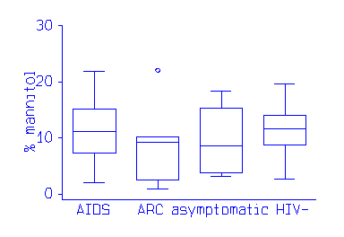
For display purposes, an observation whose distance from the edge of the box (i.e. the quartile) is more than 1.5 times the length of the box (i.e. the interquartile range, Section 4.7) may be called an outlier. Outliers may be shown as separate points.
The plot is useful for showing the comparison of several groups. This example shows a fat absorbtion test in patients who have AIDS, AIDS Related complex, are HIV positive but asymptomatic, and normal controls:
Back to An Introduction to Medical Statistics contents
Go to Question on box and whisker plots from Statistical Questions in Evidence-based Medicine
Bcak to Martin Bland's Home Page
This page maintained by Martin Bland.
Last updated: 29 June, 2005.