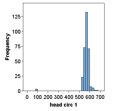
Question 2: Draw histograms of the head circumference data. How does the information revealed compare to that shown using frequencies?
Using Graphs, Histogram, and choosing the variable head circ1, we get:
I have of course edited this to make it easier to read on a web page. Try to do the same. You can change the format of the numbers in the scale using Number Format in the chart editor.
The histogram for head circ 2 is similar:
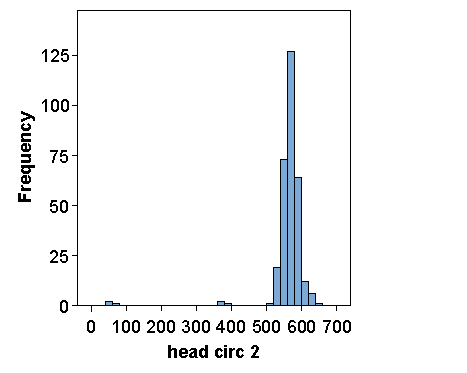
The histograms make the small head circumferences stand out very well, but do not reveal the digit preference.
Back to Exercise: Checking student data.
To Applied Biostatistics index.
To Martin Bland's M.Sc. index.
This page maintained by Martin Bland.
Last updated: 19 October, 2006.