 |
||||||
 |
||||||
|
Wednesday, January 15, 2003
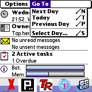
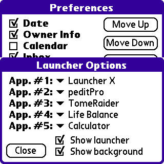
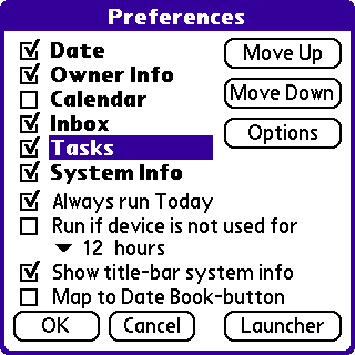
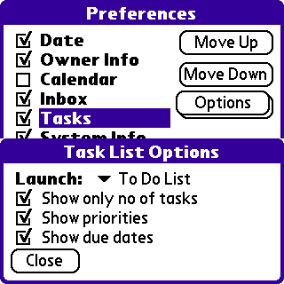
TodayI tried Today 1.8, which everyone raves about, but did not like it. For a start, how does it need 180kb to do something this simple? And what is this obsession with skins? I get a choice of lots of different icons, but nothing simple like the ability to show only the text. Come on, think about it: if you have a display divided into four sections showing, respectively, today's date, your name, the times of your appointments, and your current to-dos with priorities, do you need an icon to tell you which is which? But it is freeware and clearly some people like it, so I musn't grumble. And apart from the option to get rid of the icons altogether it is very customizable:
Looking at these images, I can see the attraction, but for the time being I am going to carry on using the standard Datebook 'Today' view - at least until someone writes an applet which allows display of untimed, timed and to-do entries in three separate sections, and allows one to filter either all to-dos due by the chosen date, or all due on the chosen date. Actually, let's have four sections: 1. Untimed events for the chosen date. 2. Timed events for the chosen date. 3. Uncompleted to-dos due before the chosen date. 4. Uncompleted to-dos due on the chosen date. Maybe 3 and 4 could be distinguished by font colour. And it would need good Navigator support. The Datebook version allows right/left scrolling through dates, but not up/down scrolling through lists, whereas Today 1.8 has the opposite, but lacks the ability to return to the Launcher by holding the select button for 2 seconds. |