Click Analyze, Regression, Linear. Select Quadriceps strength into Dependent and Height and Age into Independents(s). Now click Plots.
I did not actually do these plots in the lecture (my mistake),
but we did them for the simple linear regression in
To plot residuals against predicted values we need to put one of
the residuals variables into Y and one of the predicted variables into X.
ZPRED and ZRESID are standardised, i.e. made to have mean zero
and standard deviation one.
ADJPRED and DRESID are in the original units, the natural predicted strength
in newtons and the difference of the observed and predicted strength in newtons.
I chose the natural units, so put *ADJPRED into X:
and *DRESID into Y:.
I also clicked Histogram and Normal probability plot.
Click Continue.
Click OK.
You will get five tables of output, then three graphs.
I have edited these to make them easier to read on screen.
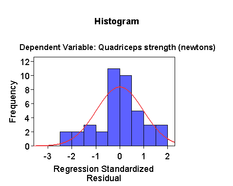
The histogram has too many intervals for only 41 observations,
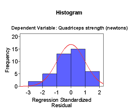
so we can make the intervals larger:
The distribution is a bit skew to the left, but not much.
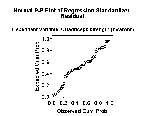
The Normal plot also has a bit of a curve in it.
The Normal plot is of the P-P type, rather than the Q-Q type, but the interpretation is the same.
A curve towards less steep indicates negative skewness.
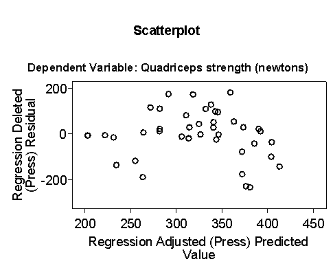
The plot of residual against predicted shows a possible relationship,
with residuals being smaller at the ends and bigger in the middle.
The model does not appear to be a very good fit to the data.
Back to Exercise: Multiple regression of muscle strength on age and height.
To Applied Biostatistics index.
To Martin Bland's M.Sc. index.
This page maintained by Martin Bland. 


Last updated: 19 December, 2006.