Books

Short works

Books : reviews

Donald A. Norman.
The Psychology of Everyday Things (== The Design of Everyday Things) .
Basic Books / Harper Collins. 1988

rating : 1.5 : unmissable

Even the smartest among us can feel inept as we fail to figure out which light switch or oven burner to turn on, or whether to push, pull, or slide a door. The fault, argues this fascinating, ingenious—even liberating—book, lies not in ourselves, but in product design that ignores the needs of users and the principles of cognitive psychology.

The problems range from ambiguous and hidden controls to arbitrary relationships between controls and functions, coupled with a lack of feedback or other assistance and unreasonable demands on memorization. The book presents examples aplenty—among them, the VCR, computer, and office telephone, all models of how not to design for people.

But good, usable design is possible. The rules are simple: make things visible, exploit natural relationships that couple function and control, and make intelligent use of constraints. The goal: guide the user effortlessly to the right action on the right control at the right time. But the designer must care.

The author is a world-famous psychologist and pioneer in the application of cognitive science. His aim is to raise the consciousness of both consumers and designers to the delights of products that are easy to use and understand.

You will never look at the PUSH ‘instruction manual’ on a door the same way again

Donald A. Norman.
Turn Signs are the Facial Expressions of Automobiles.
Addison-Wesley. 1992

rating : 3 : worth reading
review : 15 February 2004

From water faucets and airplane cockpits to the concept of “real time” and the future of memory, this wide-ranging tour through technology provides a new understanding of how the gadgets that surround us affect our lives. Donald Norman explores the plight of humans living in a world ruled by a technology that seems to exist for its own sake, oblivious to the needs of the people who create it. Turn Signals is an intelligent, whimsical, curmudgeonly look at our love/hate relationship with machines, as well as a persuasive call for the humanization of modern design.

This is a collection of essays about design, all the way from what to call "5-past-midnight", to how to design aeroplane cockpits so that pilots don't make mistakes. All the faults are pointed out with such clarity, that you wonder why everyone doesn't design things in the obviously correct way.

One major theme running through the essays is that our machines should communicate with us, let us know what they are doing, so we can tell if something is going wrong, and not be surprised by sudden changes in behaviour. (The tale of the auto-pilot correcting ever more strong for a yaw caused by a fuel leak, until it just suddenly "gave up" and the plane fell several miles, is certainly food for thought.)

These essays are over a decade old. Is design any better nowadays? Rarely, unfortunately, although some lessons have been learned.

Donald A. Norman.
Things That Make Us Smart: defending human attributes in the age of the machine.
Perseus Books. 1993

rating : 3.5 : worth reading
review : 17 March 2002

Norman inveighs against the way our cognitive artifacts are currently designed. Technology is good at a lot of the things we are bad at -- it is orderly, logical, methodical. Yet rather than exploiting this to complement our strengths of creativity and flexibility, rather than supporting our way of working, we often design it in a way that highlights our weaknesses, forcing us to conform to its way of working.

He also points out that we have two main modes of thought: experiential and reflective, each requiring different kinds of interaction with technology. Ironically, the technology often seems to be designed to break the experiential mode, forcing us to be reflective, to ponder choices, when that is the inappropriate mode, yet also to disallow that reflection just when we need it.

Norman makes excellent points. It has been a decade since the book was written. Have things got any better? Not really. But it is important for people to keep plugging away at this issue. Remember, every time there is a disaster caused by "human error", it is more likely that the fault lies in our technology, not in ourselves.

Donald A. Norman.
The Invisible Computer: why good products can fail, the personal computer is so complex, and information appliances are the solution.
MIT Press. 1998

rating : 3.5 : worth reading
review : 27 May 2000

Personal computers are expanding into the mass consumer market, from the specialist hi-tech market. But this new market consists of the more conservative late adopters, who want practicality and ease-of-use, not the technophilic early adopters who were willing to put up with how over-complicated PCs are.

Norman explains how these markets differ, why the bare over-general purpose PC can probably never become the kind of product the average consumer wants, how the answer is to move the appropriate computational power inside smart special-purpose "information appliances", and why this is going to be a painful process for the industry.

The flow of the argument is a little jerky, and rather repetitive in places. But Norman makes his customary trenchant points, and draws some good parallels with other similar technology changes and industrial blind-spots in the past -- such as electric motors, and the phonograph.

Donald A. Norman.
Emotional Design: why we love (or hate) everyday things.
Basic Books. 2004

rating : 3.5 : worth reading
review : 25 September 2006

In The Psychology of Everyday Things Norman showed us how functionality is so important in design, and why so many of our artefacts don't work well. It was revolutionary, but, as he admits here, told only part of the story. What was missing is our emotional reaction to our things.

Here he build a three layer theory of that reaction: visceral (first impressions, the "wow, I want one!" reaction, conditioned mostly by our evolutionary heritage), behavioural (our response to how well the thing in question works, from our point of view), and reflective (mediated by cognition, and culture, but still emotional, such as pride in our ability to master the thing). These three levels all contribute to our emotional reaction, possibly in contradictory ways (such as an acquired taste for viscerally repugnant bitter flavours). There are no easy answers, but lots of fascinating discussions.

In the second half of the book, Norman concentrates on emotions applied to robotics: how robots would need to discern our emotions (to get feedback on how well they are performing, and to anticipate our desires), and why they would need emotions of their own (to function in a complex world of partial information). There are some interesting ideas (I particularly like the "pantry robot"), and some links with Rosalind Picard's and Antonio Damasio's work. I also like the way Norman takes science fictional "scenario building" seriously. An interesting romp through emotions for robots, with some compelling ideas.

Donald A. Norman.
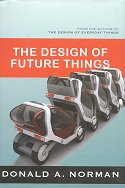
The Design of Future Things.
Basic Books. 2007

rating : 3.5 : worth reading
review : 4 August 2012

Norman continues his study of how people interact with their engineered devices. here the emphasis is on "future" devices, that are smart, but not really smart enough. They can do a lot, so much that we are tempted to believe they are truly intelligent, but they are not. Or they can do a lot, but with a "psychology" so opaque and alien to us, that we cannot make best use of them, we cannot work together. What to do?

It comes down to design, of course. Here the design needs to encompass both the task, and the human capabilities. Don't automate just because you can, maybe leading to complex and expensive maintenance requirements; automate to enhance the overall productivity. Provide the user a clear simple conceptual model, to reduce the alienness of the device's behaviour. Concentrate on communication between human and machine (in both directions), including natural feedback (no meaningless and annoying beeping) and "reassurance". And maybe, design so that the humans, who are the more flexible partners, can make modest adaptations of behaviour to enhance the interaction.

Donald A. Norman.
Living with Complexity.
MIT Press. 2011

rating : 3.5 : worth reading
review : 19 July 2018

If only today’s technology were simpler! It’s the universal lament, but it’s wrong. We don’t want simplicity. Simple tools are not up to the task. The world is complex; our tools need to match that complexity.

Simplicity turns out to be more complex than we thought. In this provocative and informative book, Don Norman writes that the complexity of our technology must mirror the complexity and richness of our lives. It’s not complexity that’s the problem, it’s bad design. Bad design complicates things unnecessarily and confuses us. Good design can tame complexity.

Norman gives us a crash course in the virtues of complexity. But even such simple things as salt and pepper shakers, doors, and light switches become complicated when we have to deal with many of them, each somewhat different. Managing complexity, says Norman, is a partnership. Designers have to produce things that tame complexity. But we too have to do our part: we have to take the time to learn the structure and practice the skills. This is how we mastered reading and writing, driving a car, and playing sports, and this is how we can master our complex tools.

Complexity is good. Simplicity is misleading. The good life is complex, rich, and rewarding—but only if it is understandable, sensible, and meaningful.

It is interesting to watch Norman’s design philosophy evolve over a series of books. His 1988 classic The Psychology of Everyday Things argues for simplicity and naturalness in design. In his 2004 Emotional Design he is arguing for the consideration of the users’ aesthetic reaction to that design. And by 2007, in The Design of Future Things, he is focussing on the need for good communication between our ever-“smarter” technologies and us.

This 2011 book, Living with Complexity, admits that maybe simplicity and aesthetics isn’t the be-all and end-all of design. Our world, both natural and technological, is a complex place, and we want rich, complex interactions with it. Norman’s argument here is that good design should support that rich complexity, rather than making life harder by being unnecessarily complicated.

[p2] I use the word “complexity” to describe a state of the world. The word “complicated” describes a state of mind. The dictionary definition for “complexity” suggests things with many intricate and interrelated parts, which is just how I use the term. The definition for “complicated” includes as a secondary meaning “confusing,” which is what I am concerned with in my definition of that word.

There is a consequence of wanting rich complexity, however: it takes time to learn how to master it. We are (or should be) willing to put in the time when the reward is that richness.

[p30] Do we dislike the fact that learning to read and write, play musical instruments, and drive a car are all so complex? Not really. We don’t mind complexity when it seems appropriate. Yes, we truly dislike spending an hour learning some arcane, bizarre machinery. But we are willing to spend weeks or years learning other things, where the difficulties and complexity seem appropriate to the tasks

The issue is that we are often not willing to put in the time to learn complex tools. We seem to think everything should be easy to use (maybe because we have read some of Norman’s earlier books?) Norman argues for an even-handed approach: a willingness of designers to design well, removing complication, coupled with a willingness from users to put in the time to learn how to use the well-designed toolset. (Personally, I am willing to put in the time, but only in a staged manner: I want standard tasks to be simple and do-able without needing the full “10,000 hours” of mastery first, and only the richer, more sophisticated tasks to require a corresponding level of extra effort. That property, presumably, is part of the non-complicated design requirement.)

Norman offers a few guidelines on how to design well for complexity. The main one is to take a whole systems view: don’t improve just a single part of a malfunctioning system, rather, analyse the system to find where the real problem is, and redesign the whole of the “user experience” from beginning to end.

[p148] Never solve the problem the client has asked you to solve. Why? Because the client is usually responding to the symptoms. The first job of the designer, sometimes the hardest part of the entire task, is to discover what the underlying problem is, what problem really needs to be solved. We call this finding the root cause.

Of course, this is easier said than done in most cases. However, it is good to see an emphasis on treating a complex system as something that needs to be engaged with, not simplified out of existence.

Unfortunately, I found the quality of the book itself somewhat poor. The text feels rushed and not fully polished, with a lot of repetition, as if an idea was written down, then reworded, but the original not deleted. The quality of the photographs is very poor: often too small and too dark to fully appreciate the point being illustrated. And I have the hardback, not just a paperback with traditionally poorer quality pictures. It is also typeset in a sans serif font, which I personally find ugly and hard to read. Nevertheless, there is an interesting and worthwhile idea in here, about taking a systems design view in a necessarily complex world.