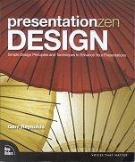
Reynolds discusses how to design presentation slides to greatest effect. This assumes you already know what it is you want to present (I understand this is covered in his previous book, although I haven't read it); here he describes how to accompany that with well designed slides. The emphasis is on single presentations making a single point (eg, a sales pitch), not on a group of presentations delivering a lot of material (eg, a lecture course). So this allows the content to be pared down and decluttered. From the title, you can guess the underlying metaphor comes from Zen: simplicity, clarity, lack of clutter, beauty. Here the use of Zen isn't just some shallow metaphor; Reynolds has spent a long time in Japan, absorbing the philosophy.
Unfortunately, from my point of view at least, although the metaphor isn't shallow, the delivery is, to some degree. Each example given shows the approach in practice, but I don't think there are enough examples, or enough variety in the examples, for me to be able to abstract the principles from them. Also, and this is no fault of the author, I have seen some of this kind of material before (use consistent fonts, uses sans serif, use large pictures, use simple charts), and hence it wasn't an eye-opening experience. And, a book on clarity of presentation, including how to clearly present charts, that barely mentions Tufte?
However, there were a few points I enjoyed. In particular, his defence of Helvetica:
Another point is the over-use of symmetry, summed up in this chapter-heading quotation from an architect:
An appreciation for asymmetrical
balance is considered by many to
demonstrate a capacity for higher-
order thinking.
--- Matthew Frederick, architect
I once heard a different architect say something like "symmetry is a sign of a sick mind", immediately after someone else's presentation of a proposed symmetric design for a new building, so I appreciated this comment.
One part that I thought most important is the discussion of the role of free choice and constraints.
... Schwartz lists 11 ways we can halt the crippling effects of too much choice---"the tyranny of small decisions." The last item is simply this: "Learn to love constraints."
In Buddhism Plain and Simple ... Steve Hagen says that "...no freedom lies in maximizing petty choices."
This discussion reminded me of something I read soon after the first Apple II with proportional fonts came out: "just because you can put a picture of a fried egg in your text, doesn't mean you should". You don't have to use the ever-increasing number of bells and whistles in the latest version of your slide package. Design a simple style, and stick with it. Exploring the boundaries imposed by constraints can lead to more inventive solutions than you would find from unconstrained freedom.
