Coverage bias in the HadCRUT4 temperature record
Kevin Cowtan and Robert Way
Background
Table of contents:
- Summary
- Scientific context
- Previous research
- Evidence for underestimation of recent temperature trends
- How do the results compare to other measures of global temperature?
- Did the Met Office get it wrong?
- What about the IPCC?
- Is the 16 year trend statistically significant?
- About the authors
Summary
The Met Office temperature record, HadCRUT4, is widely quoted as a measure of global warming. However observations are only available for about 84% (five sixths) of the planet. The omitted region includes the Arctic, which is warming much faster than the rest of the planet. As a result, HadCRUT4 underestimates the rate of warming in recent years.
We have developed a method for using satellite data to fill in the gaps in the Met Office data. Our global record suggests that surface temperatures have been warming two and a half times faster than Met Office estimates over the past 16 years. Temperature trends starting in 1997 or 1998 are particularly affected.
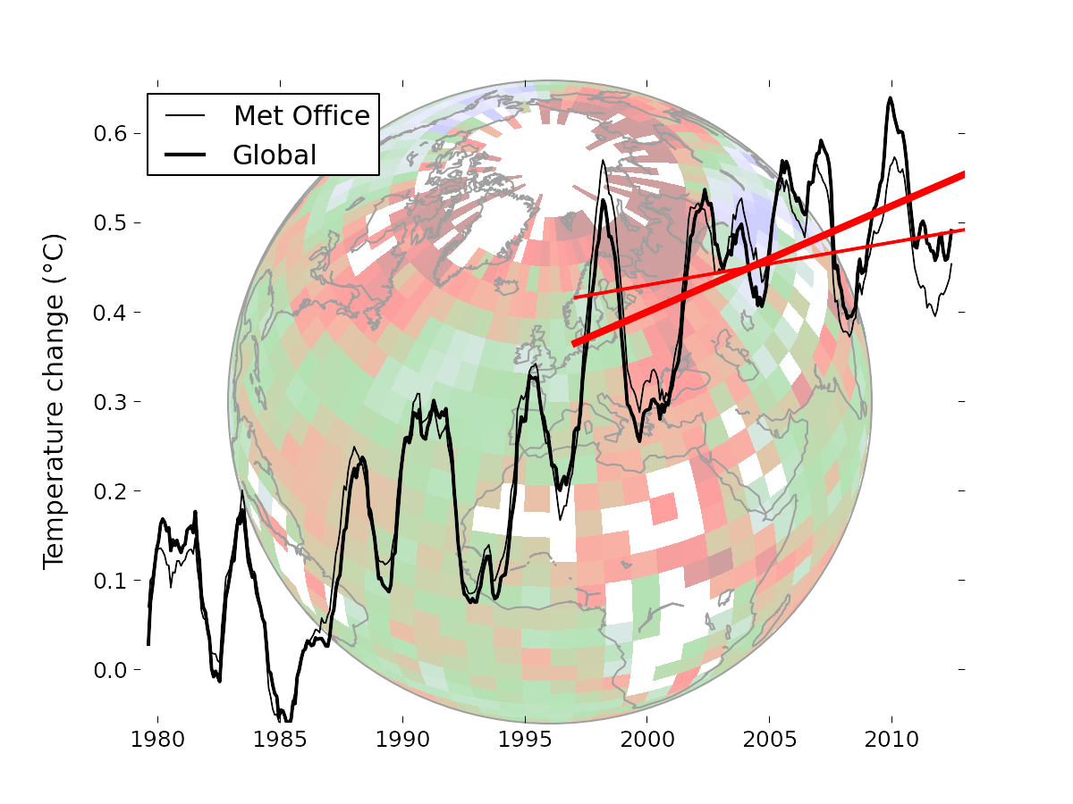
Temperature data from the Met Office (thin lines) compared to the optimal Cowtan and Way (2013) global reconstruction (thick lines). The straight red lines indicate the trend over the past 16 years in the respective data. The background image illustrates the coverage of the Met Office data, with colours indicating geographical temperature trends. The Arctic is warming much faster than the rest of the planet.
The temperature change for any individual year is not very large (and less than the Met Office uncertainty estimates), but together they make a significant difference to recent temperature trends. This highlights the danger of drawing conclusions from trends calculated over short periods.
Scientific context
Climate scientists have traditionally looked at climate over long periods - 30 years or more. However media and public interest in shorter term trends has focussed attention on the past 15-16 years. Short term trends are much more complex because they can be affected by many factors which cancel out over longer periods. To interpret the 16 year trend, it is necessary to take into account all of these factors, including volcanoes, the solar cycle, particulate emissions from the far East and changes in ocean circulation. The bias addressed by this paper is just one piece in that puzzle, although a largish one.
Most of the other factors affecting the recent temperature trend were discussed in a recent Met Office meeting.
Previous research
Probably the first mention of an underestimation of recent warming due to poor Arctic coverage comes from Hansen in 2006, who sought to explain why the NASA temperature data showed 2005 as being a record breaking warm year, in contrast to the Met Office temperature record. He used satellite radiometer data to show that 2005 was an exceptionally warm year, a result largely missed by the Met Office due to coverage bias. This was explored further by Benestad in 2008, using a relatively new form of climate data assimilation called ‘reanalysis’ to show the impacts of coverage bias in the HadCRUT record.
Part of the impetus for our work came from a Met Office press release in 2009, which stated ‘… HadCRUT is sampling regions that have exhibited less change, on average, than the entire globe over this particular period … We therefore infer with high confidence that the HadCRUT record is at the lower end of likely warming.’. The paper is Simmons et al (2010).
The coverage issue was later discussed by Hansen (2010) and Folland et al 2013 which both concluded that the lack of Arctic meteorological data impacted the trend in the Met Office temperature record.
Evidence for underestimation of recent temperature trends
The Met Office temperature data only covers about ⅚ of the planet, with the largest unobserved regions being Antarctica, the Arctic, and some continental interiors. The Arctic is particularly important since it is warming much faster than the rest of the planet. There are a number of sources of evidence for the rapid warming of the Arctic:
- A few high latitude weather stations.
- Satellite observations of temperatures in the lower atmosphere.
- Reanalyses, created by running modern weather models on historical data to infer the state of the atmosphere.
Other supporting evidence not used in this work include:
- Satellite radiometer data (for example Hansen 2006, Chapman et al 2013).
- Weather balloons (Thorne et al 2005).
- Climate models (see for example a comparison by Dr Ed Hawkins).
- Arctic ice loss (although this is strongly influenced by other factors).
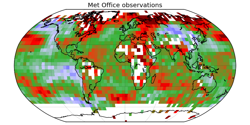
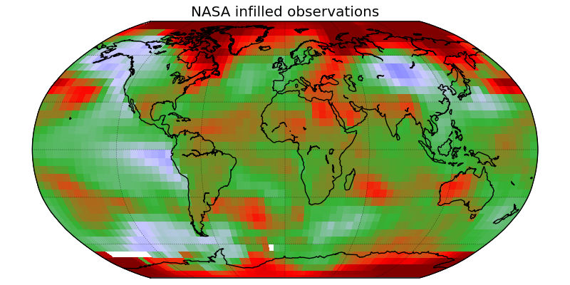
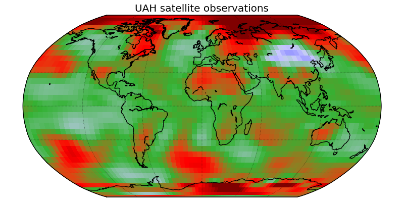
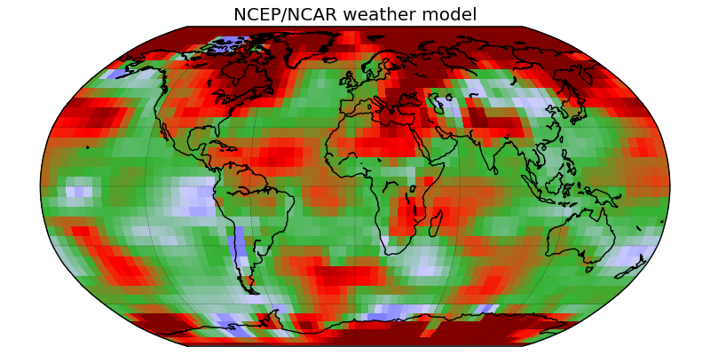
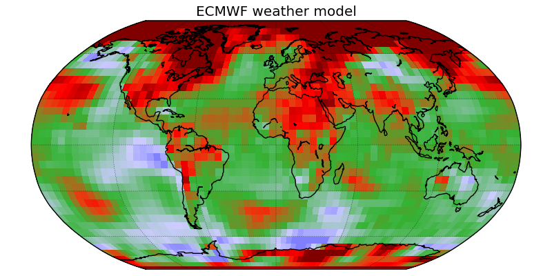
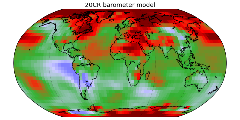
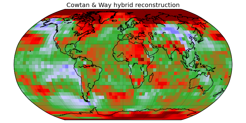

Comparison of the Met Office 16 year trend maps to 5 other sources: The NASA infilled data, the UAH satellite data and three weather models, and to the new hybrid reconstruction.
How do the results compare to other measures of global temperature?
NOTE: This section is obsolete. See the update of 2014-04-04.
The other widely quoted measures of global mean surface temperature are the GISTEMP record from the National Aeronautics and Space Administration (NASA) and the NCDC record from the National Oceanic and Atmospheric Administration (NOAA). Our results show slightly faster warming over the past 16 years than the NASA data, and significantly faster warming that NOAA. What is the reason for this discrepancy?
There are two known observational biases which impact recent temperature trends. Coverage bias, addressed in this paper, impacts the Met Office and NOAA data. A bias in sea surface temperature observations (arising from a recent transition from ships to buoys) is present in the NASA and NOAA data. We anticipate that when both of these biases are corrected, the resulting records will show even better agreement.
Coverage bias | Sea surface temperature bias | |
|---|---|---|
Met Office | X | |
NASA | X | |
NOAA | X | X |
If the Met Office sea surface temperature corrections are applied to the NASA data, the resulting 16 year trend (i.e. 1997-2012) is 0.103°C/decade. Using the Met Office data and a similar reconstruction method we obtain a similar trend of 0.108°C/decade. Our best reconstruction including the satellite data shows a trend of 0.119°C/decade.
Did the Met Office get it wrong?
No. The Met Office have been reporting the existence of this bias since 2009, although the issue has not received widespread media coverage. The Met Office also provide uncertainty estimates for their temperature data: our results fall within the 95% confidence intervals of the annual data.
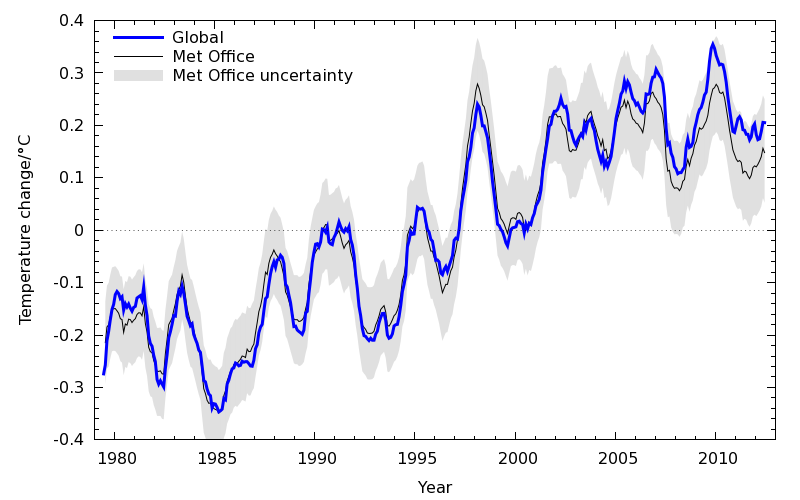
Comparison of the hybrid global temperatures to the Met Office values, showing the Met Office uncertainty bounds.
We started from a desire to understand the differences between different versions of the surface temperature record. As a result it was probably easier for us to tackle the problem as outsiders than for someone in one of the existing groups.
We based our final reconstruction on the Met Office data because they are the only group to have addressed the (much harder) problem of sea surface temperature bias.
What about the IPCC?
The IPCC does not perform original research; it can only summarise research from the peer-reviewed literature. The deadline for submission of papers to be considered for inclusion in the IPCC AR5 report was July 2012. Much of the work on recent temperature trends - including our paper - postdates this deadline.
Is the 16 year trend statistically significant?
This often asked question usually springs from a misunderstanding of statistics. Most people hearing the phrase ‘the trend is not significant’ interpret that as evidence that there is no trend. This is an error: drawing a conclusion from the failure of statistical significance test is called the ‘null hypothesis fallacy’. The implication in this case is that 16 years is too short a period to draw a conclusion.
Our estimate of the 16 year trend is shown by a black arrow in the figure below. The light blue region represents no warming, the pink region represents accelerated warming. The curve represents the probability of different values of the trend being correct on the basis of only 16 years of data.
Neither ‘no warming’ or ‘accelerated warming’ are ruled out by our data. The implication of this is that 16 years is too short a period to draw a reliable conclusion. As it happens the hypothesis that warming has accelerated (red area) is four times as likely as the hypothesis that warming has stopped (dark blue area), although this will vary. The most probable case is that there has been a slight slowdown in the rate of warming, for reasons discussed in the Met Office briefing.
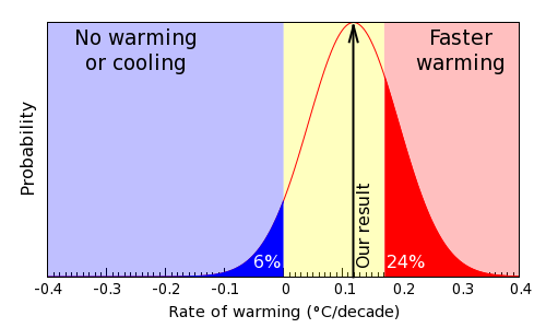
Probability distribution of trend values, showing the probabilities that global warming has stopped or accelerated.
About the authors
Kevin Cowtan trained in theoretical physics at the University of York. Apart from sabbaticals to San Diego Supercomputer Center he has spent most of his career working in the Chemistry Department at York. He develops computational methods for X-ray crystallography, with a particular focus on image reconstruction and feature recognition. His work is highly cited in the chemistry and biology literature, and his online teaching tools are also very widely used within the field and beyond. He took on this project in his spare time because the problem has synergies with his previous work and is of significant public interest.
Robert Way is a PhD student at the University of Ottawa. He holds a Master of Science from Memorial University of Newfoundland where he studied the climatic sensitivity of Torngat Mountain Glaciers. His current project is aimed at spatially modeling the distribution of permafrost in the eastern Canadian sub-Arctic. He is also a contributor to the IRIS4 working group on climate variability and change in the eastern Canadian subarctic. As an Inuit descendant from the Canadian sub-Arctic his field experience and knowledge of the cryosphere provided an important complement to Dr Cowtan's computational and analysis skills.
"No difficult scientific problem is ever solved in a single paper. I don't expect our work to be the last word on this, but I hope we have advanced the discussion." - Dr Cowtan