 d
d
Martin Bland
Dept of Health Sciences
University of York
Talk first presented to the Commission for Health Improvement, January 2004.
This talk is based partly on work done with Doug Altman (Bland and Altman 1994, 1994b).
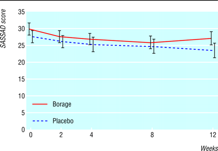
The figure below comes from a trial of the efficacy and tolerability of borage oil in adults and children with atopic eczema (Takwale et al., 2003). This was a randomised, double blind, placebo controlled, parallel group trial where patients with eczema were recruited, treated, and followed over time to assess their symptoms. The graph shows an atopic dermatitis score, SASSAD, using six areas and six signs, throughout the trial (n=140; error bars show SE).
Subjects were recruited because they had eczema which led them to seek medical advice, hence they had high symtom scores. As they are followed over time, their average score falls, whether they receive active treatment or not. This is a classic instance of regression towards the mean.
In this talk I will try to anwer the following questions:
I shall proceed mainly by illustration. I shall not go into the mathematics of regression towards the mean, but I will give refeerences to several papers describing statistical techniques for estimating its effects in different circumstances.
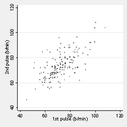
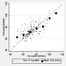
The graph below shows pulse rate measured by two different observers for 185 students. They are not the same; there is considerable variation.
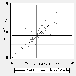
The two pulses should be the same apart from measurement error. The next figure shows the line of equality, on which the points would all lie if the pulse measurements were the same. This represents the true or functional relationship between them, that they are identical apart from error. The diagram also shows lines through the means of the two variables. The means are the same and in fact the whole distribution is the same for each variable.
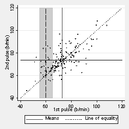
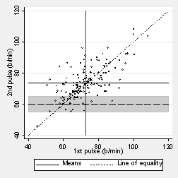
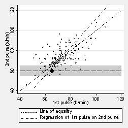
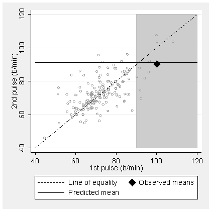
What is the mean second pulse measurement for students whose first pulse is 60 b/min? As few students have a measurement exactly 60, we can find the mean for those around 60, between 55 and 65, shown by the dark band on the next graph:
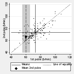
We can see that the mean is going to be more than 60 b/min. The next figure shows the point marked:
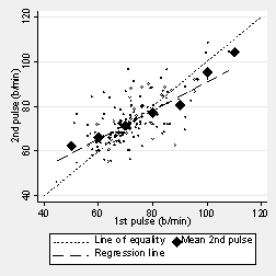
It is closer to the mean for the second measurement than is 60 b/min to the mean for the first measurement. We can do this for any value of the first pulse measurement. The next graph shows it for first measurements around 50, 60, 70, 80, etc. These means do not lie on the line of identity but on one which crosses it.
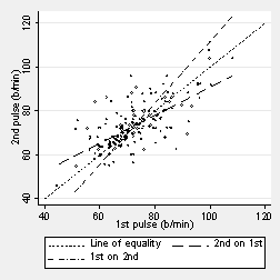
These means lie on the regression line, the regression of second pulse on first pulse. This is shown in the next graph:
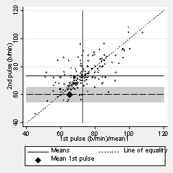
It works in the same way if we start with the second measurement. What was the average first measurement for students whose second measurement was 60 b/min?
Again, it is closer to the mean.
The mean first pulse for a given value of the second pulse lies on the other regression line, the regression of first pulse on second pulse.
There are two regression lines. Neither is the same as the line of equality, which represents the true, functional relationship.
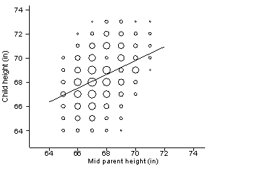
The name “regression” comes from a paper by the Victorian geneticist and polymath Francis Galton (Galton 1886) entitled “Regression towards mediocrity in hereditary stature”. Galton set up a stand at the Great Exhibition, where he measured the heights of families attending. He adjusted the female heights by multiplying by 1.08. He then calculated the average height of the two parents, the “midheight”, and related it to the height of their adult children:
This plot is based on Galton’s original. The area of the circle represents the number of coincident points. The line is the regression of child height on midparent height. The means of both are the same, 68.2 inches.
Consider parents with midheight 70 inches. Their children had heights between 67 and 73 inches, and a mean height of 69.6 inches. The mean height of the subgroup of children was closer to the mean height of all children than the mean height of the subgroup of midparents was to the mean height of parents. Galton called this ‘regression towards mediocrity’.
The same thing happens if we start with the children. For example, for the children with height 70 inches, the mean height of their midparents is 67.9 inches. This is a statistical, not a genetic phenomenon.
Galton called this “regression towards mediocrity”. Because the word “mediocrity” has acquired adverse connotations since Galton’s time, we now call it “regression towards the mean”.
Regression towards the mean can happen in several different types of study. The study of heredity is just one. Once one becomes aware of the regression effect it seems to be everywhere. The following are just a few examples; Andersen (1990) gives more.
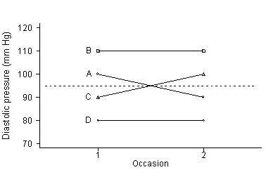
In the following graph, A and B are selected.
The average goes down, though the distribution is unchanged.
For example, in the Australian trial in mild hypertension (Reader et al. 1980), patients were selected if their average diastolic blood pressure (DBP) over four readings at two visits was between 95 and 110 mm Hg and their systolic blood pressure was below 200 mm Hg. In the placebo group, the mean DBP on screening was 100.4 mm Hg and the mean DBP during the trial was 93.9 mm Hg, a mean fall of 6.6 mm Hg without any treatment.
A non-medical example of the same thing is provided by a study of reoffending by ex-prisoners. A government minister was reported as claiming that prison sentences work, because following release from prison the next offence for which ex-prisoners were convicted tended to be for a less serious crime than that which had led to the prison sentence (Fletcher 1995). Because more serious crimes are more likely to be punished by prison sentences, ex-prisoners are a group selected because their last crime was at the extreme of the distribution. Hence the "average seriousness" of their next crimes will be lower.
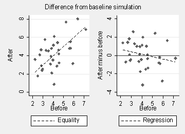
In a trial we may measure the outcome variable before and after treatment. Researchers think that if they observe some imbalance between groups on the baseline measurement, they can allow for this by taking the difference "after minus baseline" as the outcome. This does not work. The following simulations show why:
Any imbalance will be reversed, due to regression to the mean. Subjects who tend to have low baseline measurements will tend to have high after minus baseline measurements (Vickers and Altman 2001).
Suppose we wish to look at the relationship between two variables where the predictor variable is measured with error. For example, we might compare the coronary heart disease mortality in three groups of men categorized by their level of serum cholesterol. Some of the members of the low cholesterol group would be measured when they were lower than their personal mean serum cholesterol and so put in the ‘low’ group, but on subsequent measurement they would not fall into this group.
The mean observed serum cholesterol in the ‘low’ group would appear to rise when serum cholesterol was measured at a subsequent occasion, and, similarly, the mean serum cholesterol of the high group would appear to fall.
The difference in CHD mortality between the ‘low’ and the ‘high’ groups would thus be the difference in mortality between groups whose true difference in mean serum cholesterol was less than the apparent difference. The change in mortality per unit of serum cholesterol would be under-estimated.
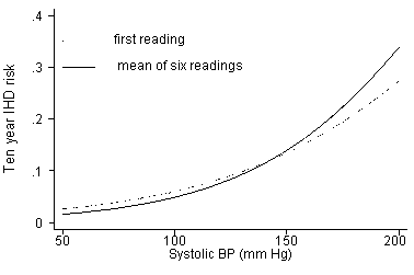
An example was given by Gardner and Heady (1973). They looked at the relationship between ischaemic heart disease (IHD) over ten years and blood pressure at the start of the period. They compared the relationship of IHD with a single measurement of blood pressure and with the mean of six measurements. The mean of six will be closer to the true value of the subject’s long term average blood pressure than will a single measurment. The relationship is therefore stronger between IHD and the mean of six BP readings than between IHD and a single BL reading.
We may be interested in the relationship between the initial value of a measurement and the change in that quantity over time. In anti-hypertensive drug trials, for example, it may be postulated that the drug’s effectiveness would be different (usually greater) for patients with more severe hypertension. Regression towards the mean will be greater for the patients with the highest initial blood pressures, so that we would expect to observe the postulated effect even in untreated patients.
In the Australian trial in mild hypertension (Reader et al. 1980), the falls in diastolic blood pressure (DBP) in the placebo group were as follows:
| Screening DBP group (mm Hg) | Mean screening DBP (mm Hg) | Mean DBP on placebo (mm Hg) | Mean fall in DBP (mm Hg) |
|---|---|---|---|
| 95-99 | 97.0 | 92.1 | 5.0 |
| 100-104 | 101.9 | 94.5 | 7.4 |
| 105-109 | 106.7 | 97.5 | 9.2 |
The higher the screening the DBP in these untreated patients, the greater the fall. This is unlikely to be due to the effectiveness of the placebo.
Here is a corresponding table from the pulse data:
| First pulse group (b/min) | Mean first pulse (b/min) | Mean second pulse (b/min) | Mean fall in pulse (b/min) |
|---|---|---|---|
| 70-79 | 73.6 | 74.8 | -1.2 |
| 80-89 | 83.1 | 78.5 | 4.6 |
| 90-129 | 99.5 | 89.8 | 9.7 |
The bigger the first pulse measurement, the greater is the mean fall to the second pulse measurement.
Clinical decisions are sometimes assessed by asking a review panel to read case notes and decide whether they agree with the decision made. Because agreement between observers is seldom perfect, the panel is sure to conclude that some decisions are ‘wrong’.
For example, Barrett et al. (1990) reviewed cases of women who had had Caesarian section because of fetal distress. Five observers reviewed case notes and decided whether they thought the Caesarian had been appropriate or not appropriate. They were not unanimous in their judgements. The percentage agreement between pairs of observers in the panel varied from 60% to 82.5% The expected agreement if they made their decisions by tossing a coin would be 50%, so this is not particularly good agreement. They judged a Caesarian ‘appropriate’ if at least four of the five observers thought a Caesarian should have been done. They concluded that 30% of all Caesarians for for fetal distress were unnecessary.
As Esmail and Bland (1990) pointed out, as only women who had undergone Caesarian were reviewed, it was inevitable that another observer would conclude that some Caesarians had been inappropriate. Given the poor agreement between the judges, this number was bound to be quite high.
When comparing two methods of measuring the same quantity, researchers are sometimes tempted to regress one method on the other. The fallacious argument is that if the methods agree the slope should be one. Because of the regression towards the mean effect, we expect the slope to be less than one even if the two methods agree closely.
For example, two studies of the validity of self-reported weight (Schlichting et al. 1981, Kuskowska-Wolk et al. 1989) used the same design. Self reported weight was obtained from a group of subjects, and the subjects were then weighed. Regression analysis was done with reported weight as the outcome variable and measure weight as the predictor variable. The regression slope was less than one in each study. According to the regression equation, the mean reported weight of heavy subjects was less than their mean measured weight, and the mean reported weight of light subjects was greater than their mean measured weight. Both Schlichting et al. (1981) and Kuskowska-Wolk et al. (1989) interpreted this as follows: those who are overweight tend to report weights below their true value, and those who are excessively thin tend to report greater weights than they really have! But, of course, we expect the slope to less than 1.0 when the distributions are the same and the true functional relationship is equality.
Recent examples of the misunderstanding of regression in the study of agreement between different methods of measurement can be found in the talk “Applying the Right Statistics: Analyses of Measurement Studies” available on this website and published in an expanded version by Bland and Altman (2003).
Two phase sampling is procedure for studying small subgroups of a population. We take a large sample of the population (the first phase) and find out which are the members of the subgroups in which we are interested. We then take a sample from these subgroups for more detailed study (the second phase).
7000 children were asked about their cigarette smoking to obtain a sample of child smokers and non-smokers. The second phase sample was: all children reporting smoking one or more cigarettes a day, and random samples of those smoking one or more a week, less than one a week, and never having smoked. Four months later the children in the second phase sample were given a detailed questionnaire, including a further question on the amount smoked (Bewley et al., 1974). The following was obtained:
| Second occasion | First occasion | Total | |||
|---|---|---|---|---|---|
| >1/day | >1/week | occasional | never | ||
| >1/day | 15 | 5 | 2 | 0 | 22 |
| >1/week | 12 | 25 | 11 | 1 | 49 |
| occasional | 6 | 32 | 65 | 25 | 138 |
| never | 0 | 2 | 10 | 72 | 84 |
| Total | 33 | 64 | 98 | 98 | 293 |
If we analyse the data by the second occasion smoking habits, none of the groups is really representative of children from the whole population who gave these replies. We analysed them by their answers on the first questionnaire. This was my first publication and, though I didn’t realise it, it involved regression towards the mean.
We take an extreme group defined by a variable. Should they be equally extreme on other variables?
In an example from educational research, children were defined to be "gifted" if their IQ exceeded a cut-off. School attainment was measured on other scales. The mean attainment of the gifted children was fewer SDs above the population mean than was mean IQ for this group. This was interpreted as meaning that schools were failing "gifted" children.
Referees for papers submitted for publication do not always agree as to which papers should be accepted. Because referees’ judgements of the quality of papers are made with error, they cannot be perfectly correlated with any measure of the true quality of the paper.
Thus when an editor accepts the ‘best’ papers for publication, the average quality of these will be less than the editor thinks, and the average quality of those rejected will be higher than the editor thinks (Rousseeuw 1991).
So the next time the Lancet turns you down and you see much weaker papers being published, be consoled that this is one more example of regression towards the mean.
A sequel to a Hollywood movie is only made if the original film is a success, which we might take as indicating that it is of i.e. of high ‘quality’, commercial quality at any rate. (Art house films rarely get sequels, though they may, in critical terms, be of high quality.) The average ‘quality’ of sequels will be closer to the mean than average ‘quality’ of originals which have sequels, due to regression towards the mean. They will thus tend to be of lower ‘quality’ than the original.
This does not mean that they are bad films. They may still have higher ‘quality’ than the average of all films. Also, this rule applies to the group as a whole, not to every member of it. A sequel is not necessarily of lower ‘quality’ than its original. It is the average ‘quality’ which is lower. However, the majority will be of lower quality than the original and so such films tend to be a disappointment, and the further from the original they get the greater the disappointment will be. "Terminator III" was a good example.
People who appear on the covers of these magazines often have bad things happen to them afterwards. Film stars flop, sportsmen lose. But you only get on these covers if you have recently been unusually successful. Regression towards the mean predicts that on average they will be less successful afterwards.
What happens to the teams of Premier League Managers of the Month? They often lose in the next month!
We can tackle the problems caused by regression to the mean at both the design and the analysis stages.
We can avoid the problems caused by regression towards the mean in “before and after” studies by the use of a control group. The randomised trial with concurrent controls obviates problems caused by regression to the mean.
For example, in the Australian trial in mild hypertension (Reader et al. 1980), the falls in diastolic blood pressure (DBP) in the treated and the placebo groups were as follows:
| Treatment group | Mean screening DBP (mm Hg) | Mean DBP on follow-up (mm Hg) | Mean fall in DBP (mm Hg) |
|---|---|---|---|
| Active | 100.5 | 88.3 | 12.2 |
| Placebo | 100.4 | 93.9 | 6.6 |
Although DBP fell in both treated and placebo groups, it fell by more in the treated group, showing the effect of the active treatment.
If we are concerned about problems arising because we want to use a baseline measurement, for example in strength of relationship in epidemiological follow-up studies or the study of the relationship between change and initial value, we can make a duplicate baseline measurement. Use one baseline measurement to select subjects or to calculate changes from and the other to use in analysis as the predictor variable.
Duplicate baseline measurements are best collected on a different occasion from the one used to group subjects. This is because the correlation between measurements on different occasions will be less than between measurements made on the same occasion.
We can also estimate the expected regression towards the mean effect when we select a subgroup. We can then compare this to the change we actually see. How we do this depends on the data available to us. I shall not give any details here, but I have given references to methods applicable in different circumstances.
The regression towards the mean effect is predicted by the following version of the regression equation:
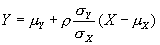
where
 is the correlation between X and Y.
How we use this depends on what data we have and how reliably we can estimate the elements of the equation.
is the correlation between X and Y.
How we use this depends on what data we have and how reliably we can estimate the elements of the equation.
Do not use differences from baseline. Use analysis of covariance instead, with the baseline measurement as covariate. This also has the advantage that we do not include the measurement error twice in the residual error used in t tests, regression, etc., which happens when we take differences from baseline (Vickers and Altman 2001).
We select subjects with high initial measurements and measuring them again later. To use this method we need data on the distribution of the variable in the whole population from which the subgroup is drawn and correlation between successive measurements, r. It is described by Shepard and Finison (1983).
The expected or mean Y for a subgroup chosen so that X>x is given by:

For an illustration consider the pulse data. We have r = 0.675 and mean for first pulse = 72.6 b/min. If we select subjects whose first pulse is greater than 90 b/min, what is their predicted mean second pulse measurement? The mean first measurement is 100.2 b/min.

Hence we predict 91.2 b/min. In fact, the mean second pulse for this group is 90.4 b/min.
As the graph shows, this is very close to prediction:
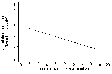
To apply this we need the right r. This may reduce as the measurements in which we are interested get further apart in time. Gordon et al. (1976) gave the following correlations between baseline and subsequent measurements of blood pressure in the Framingham Study:
Given sufficient knowledge of our variable, we can clearly estimate the appropriate correlation for any period of follow-up.
We can estimate the population mean and hence the regression effect provided the observations follow a Normal distribution. A method was given by Davis (1976) and extended by Chinn and Heller (1981). This method also enables us to deal with the effect on variables other than a remeasurement of the same thing. The method depends on the Normal assumption, but does not appear to be greatly sensitive.
This is a really nasty problem. Don’t do it or make duplicate baseline measurements if it is really important. Hayes (1988) gives a review, Blomqvist (1977) gives a method, Vollmer (1988) develops it. Simon Thompson has a Bayesian method.
Regression towards the mean is a frequently occurring phenomenon. We can estimate it in some cases and we can avoid it by design. It can make many traps for the unwary.
The most important thing is to be aware!
Andersen B. (1990) Methodological errors in medical research: an incomplete catalogue. Oxford, Blackwell. (Back to text.)
Barrett JFR, Jarvis, G.J., Macdonald, H.N., Buchan, P.C., Tyrrell S.N., and Lilford, R.J. (1990) Inconsistencies in clinical decision in Obstetrics. Lancet 336, 549-551. (Back to text.)
Bewley BR, Bland JM, Harris R. (1974) Factors associated with the starting of cigarette smoking by primary school children. British Journal of Preventive and Social Medicine 28, 37-44. (Back to text.)
Bland JM, Altman DG. (1994) Regression towards the mean. British Medical Journal 308, 1499. (Back to text.)
Bland JM, Altman DG. (1994b) Some examples of regression towards the mean. British Medical Journal 309, 780.
Bland JM and Altman DG. (2003) Applying the Right Statistics: Analyses of Measurement Studies. Ultrasound in Obstetrics and Gynecology 22, 85-93. (Back to text.)
Blomqvist N. (1977) On the relation between change and initial value. Journal of the American Statistical Association 72, 746-749. (Back to text.)
Chinn S and Heller RF. (1981) Some further results concerning regression to the mean. American Jour5nal of Epidemiology 114, 902-905. (Back to text.)
Davis CE. (1976) The effect of regression to the mean in epidemiologic and clinical studies. American Journal of Epidemiology 104, 493-498. (Back to text.)
Esmail A and Bland M. (1990) Caesarian section for fetal distress. Lancet 336, 819. (Back to text.)
Fletcher, H. (1995) Ways to reduce the risk of further crime. The Guardian, London, 14 February, page 19. (Back to text.)
Galton F. (1886) Regression towards mediocrity in hereditary stature. Journal of the Anthropological Institute 15, 246-263. (Back to text.)
Gardner, M.J. and Heady, J.A. (1973) Some effects of within-person variability in epidemiological studies. Journal of Chronic Disease 26, 781-795. (Back to text.)
Gordon T, Sorlie P, Kannel WB. (1976) Problems in the assessment of blood pressure: The Framingham Study. International Journal of Epidemiology 5, 327-334. (Back to text.)
Hayes RJ. (1988) Methods for assessing whether change depends on initial value. Statistics in Medicine 7, 915-927. (Back to text.)
James KE. (1973) Regression toward the mean in uncontrolled clinical studies. Biometrics 29, 121-130. (Back to text.)
Kuskowska-Wolk, A., Karlsson, P., Stolt, M., and Rossner, S. (1989) The predictive value of body mass index based on reported weight and height. International Journal of Obesity 13, 441-43. (Back to text.)
Mee RW and Tin CC. (1991) Regression towards the mean and the paired sample t test. American Statistician 45, 39-42. (Back to text.)
Reader R et al. (1980) The Australian trial in mild hypertension: report by the management committee. Lancet i 1261-7. (Back to text.)
Rousseeuw PJ. (1991) Why the wrong papers get published. Chance 4, 41-43. (Back to text.)
Schlichting P, Hoilund-Carlsen PF, and Quaade F. (1981) Comparison of self reported height and weight with controlled height and weight in women and men. International Journal of Obesity 5, 67-76. (Back to text.)
Senn SJ and Brown RA. (1985) Estimating treatment effects in clinical trials subject to regression to the mean. Biometrics 41, 555-560. (Back to text.)
Shepard DS and Finison LJ. (1983) Blood pressure reductions: correcting for regression towards the mean. Preventive Medicine 12, 304-317. (Back to text.)
Takwale A, Tan E, Agarwal S, Barclay G, Ahmed I, Hotchkiss K, Thompson JR, Chapman T, Berth-Jones J. (2003) Efficacy and tolerability of borage oil in adults and children with atopic eczema: randomised, double blind, placebo controlled, parallel group trial. British Medical Journal 327, 1385-8. (Back to text.)
Vickers AJ and Altman DG. (2001) Analysing controlled trials with baseline and follow up measurements. British Medical Journal 323, 1123-1124. (Back to text.)
Vollmer WM. (1988) Comparing change in longitudinal studies: adjusting for initial value. Journal of Clinical Epidemiology 41, 651-657. (Back to text.)
Back to Martin Bland’s Home Page.
This page is maintained by Martin Bland.
Last updated: 28 February, 2013.