Evaluating biases in Sea Surface Temperature records using coastal weather stations
Kevin Cowtan, Robert Rohde, Zeke Hausfather
FAQ
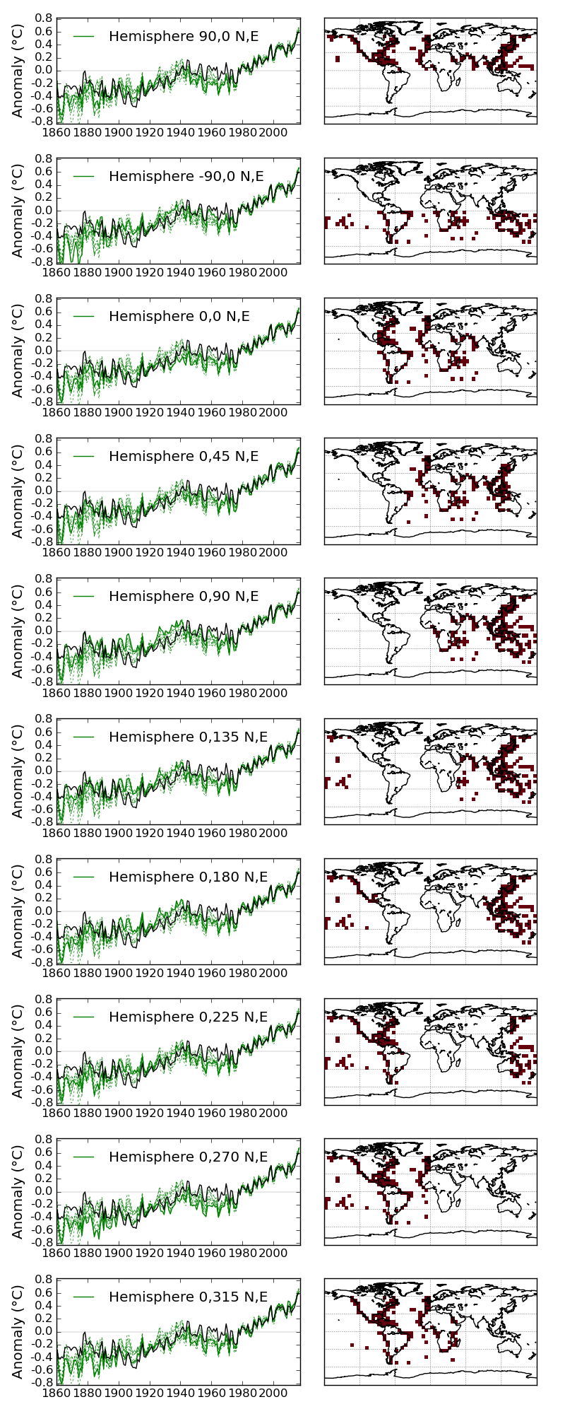
- In the top panel of figure 7, which lines correspond to which hemispheres of data?
-
See this figure. The coverage of the coastal differences for each month can be determined from this file: coastal_diff.nc.
more/less
In the left panel the solid green line represents an individual ensemble member. The red squares in the right panel represent the coastal differences in December 2016 used in constructing that ensemble member. The bimodality of the bias around 1890 and 1910 may be connected with the inclusion of Atlantic observations.